2022 // branding
My measured proposal for BCB's new branding
About the brand
What sets BCB apart from its competitors is that it benefits from a wide range of measurement devices. BCB is truly the master of the trade thanks to the available equipment and workforce. These resources also ensure that BCB performs services quickly and accurately. The company can be considered innovative.
The advice that BCB shares with its customers aims to reduce the ecological footprint and promote the sustainability of buildings. They make buildings more energy-efficient. The 20 years of expertise should not be forgotten and can be felt in the honest advice communicated to the customer.
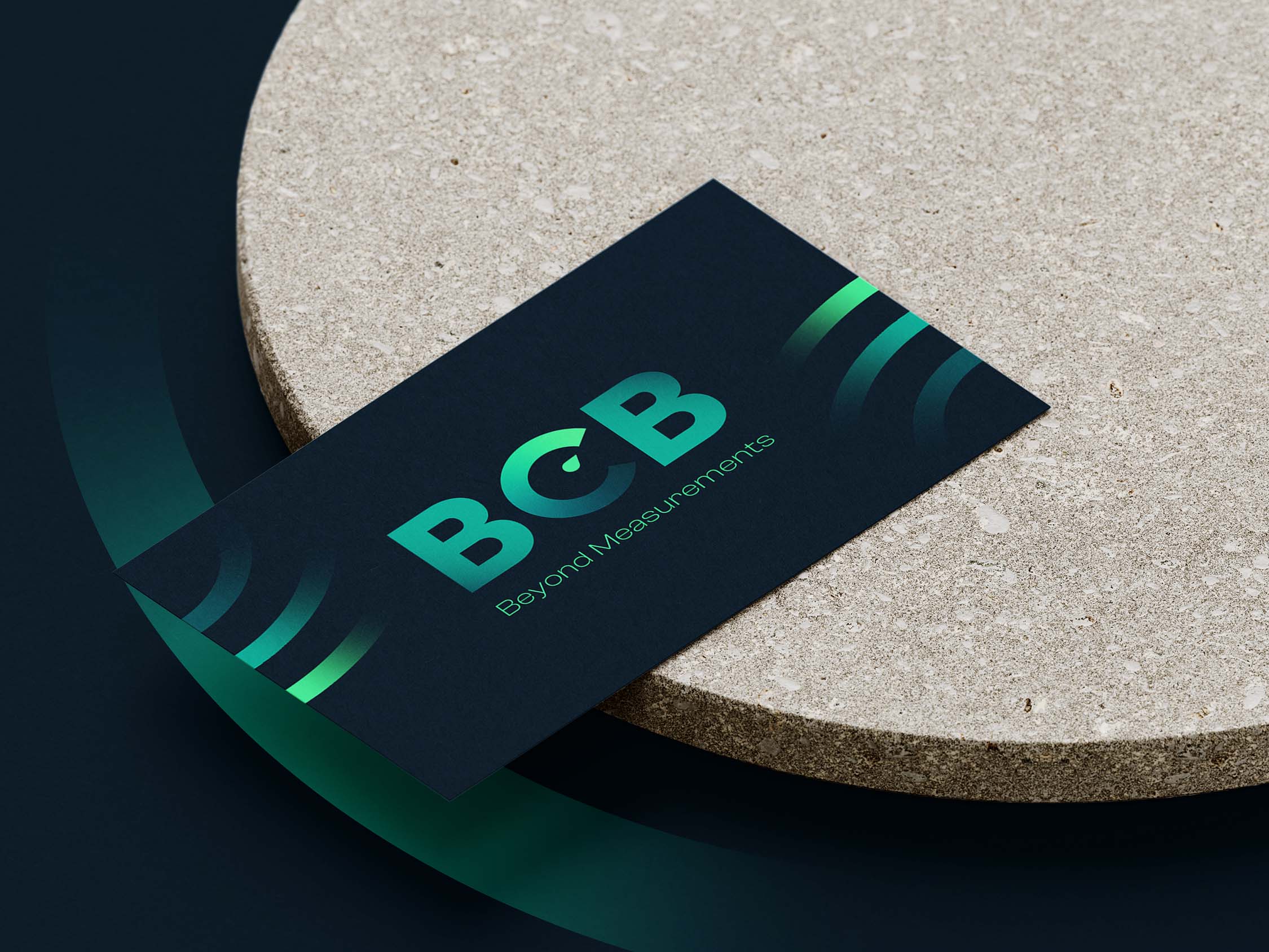
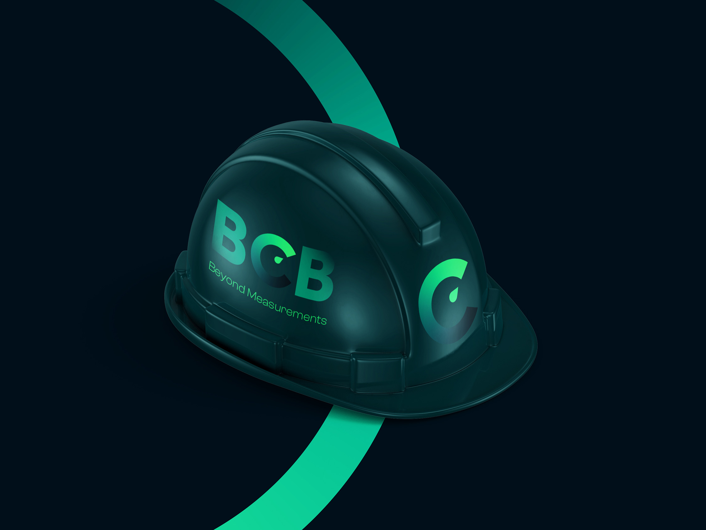
Logo
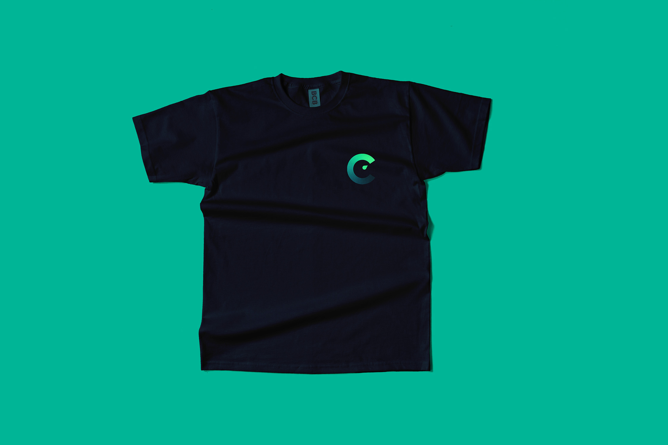
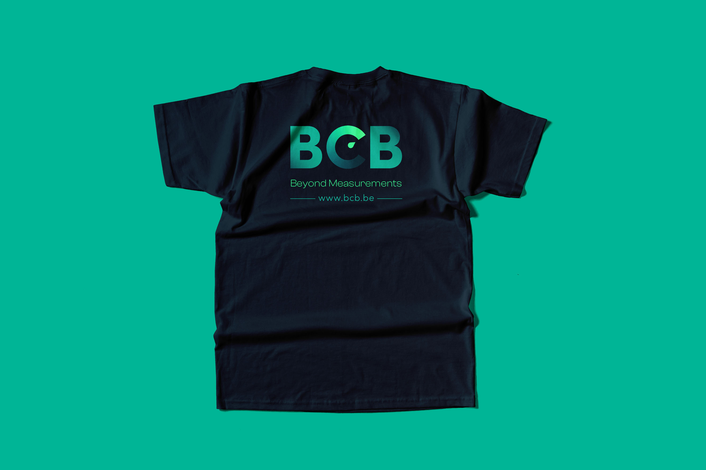
For the logo, I chose a meter knob that goes from a dark colour (bad) to a lighter one (good). The arrow also points to the maximum because BCB ensures that you get the most potential out of your building. The colour I've chosen is also green because buildings get a greener energy performance score (E-peil) thanks to the expert advice provided by the employees from BCB.
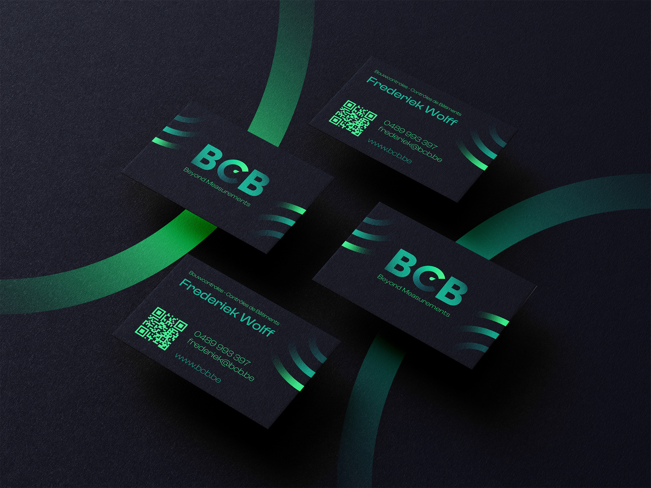
Visual style
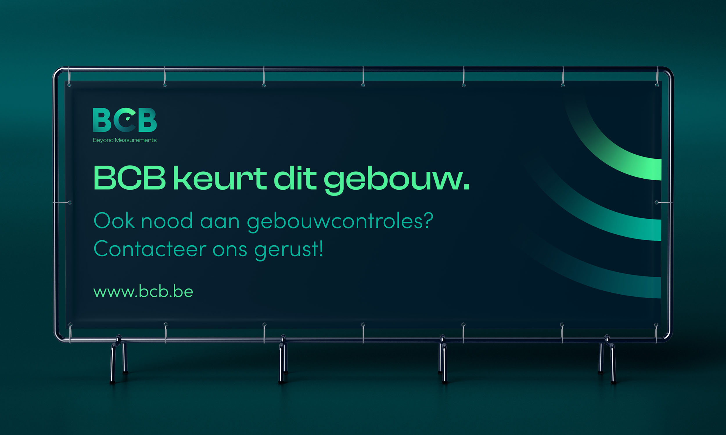
The chosen typefaces contrast with each other in style. The Clash Grotesk font looks innovative and daring, giving a feeling of exclusivity without compromising on friendliness.
Sofia Pro is a simple, readable sans serif font that can be used for both body text and the logo.
The result of the two fonts creates a modern whole with an innovative touch that strengthens the renewal of BCB. The innovative element is important because the brand always uses the latest technologies for measurements and controls.
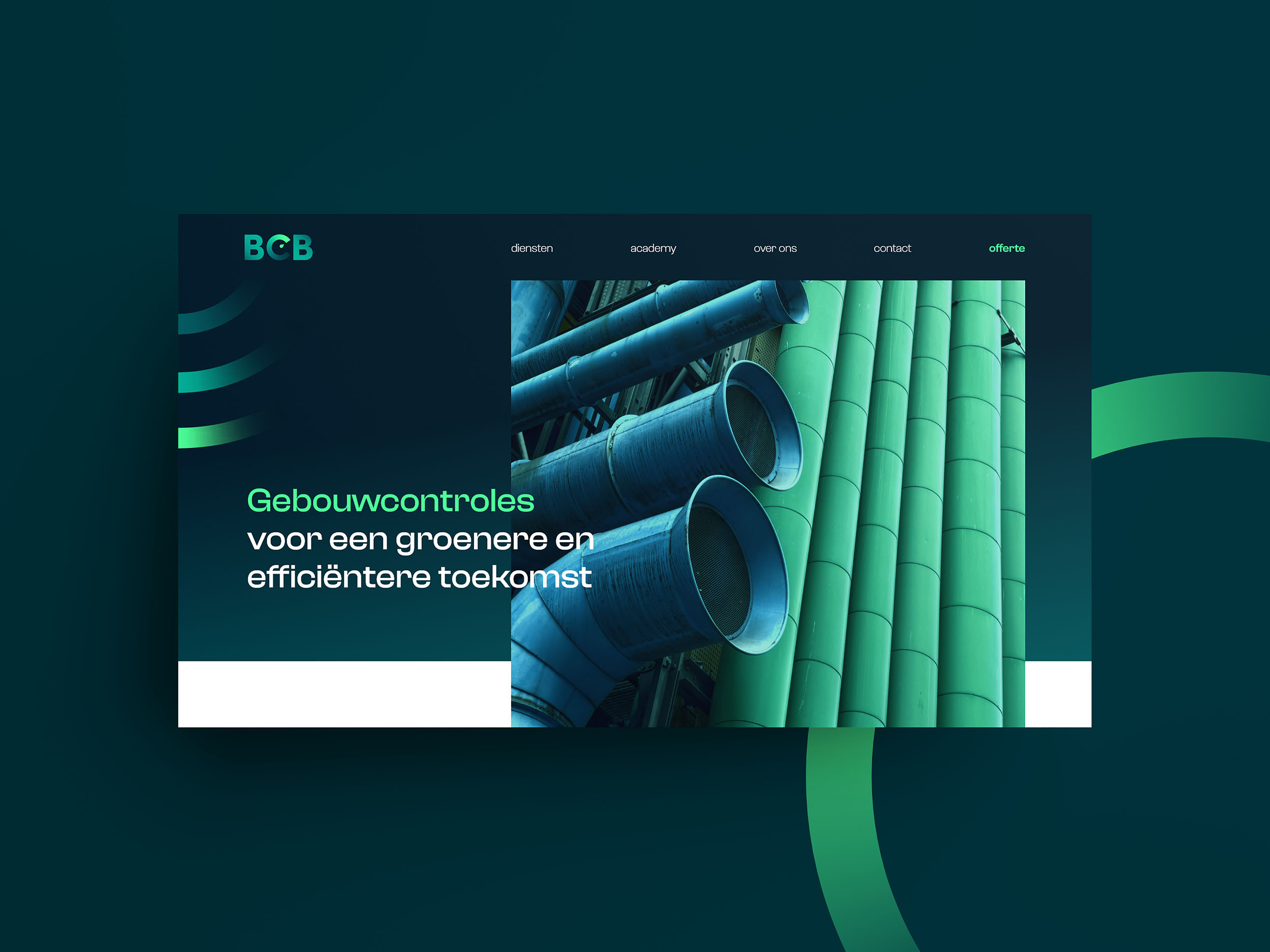
Website
The website follows the momentum of the branding and uses the visual elements that make the visual style recognizable. The website prototype that follows also uses hover effects and animations. These effects demonstrate the possibilities of the visual style in motion. The page is fully scrollable and ready for your discovery.
