2021 // branding
Fictional rebranding for Vietnamese coffee company Trung Nguyên
About the brand
Trung Nguyên is a Vietnamese business group engaged in the production and distribution of coffee. It is
the greatest coffee company within Vietnam and exports products to more than 60 countries including
large markets like the G7 countries, USA, United Kingdom, Germany, China, Canada, Russia, Japan, Dubai
and ASEAN including Singapore.
The group originated in 1996 and consists of Trung Nguyên Corporation JSC, Trung Nguyên Instant Coffee
Company JSC, Trung Nguyên Coffee LLC, G7 Commercial Services Company, Đang Lê Tourism Company JSC, Trung
Nguyên Franchising Company JSC and Coffee Hypermarket. The CEO is Dang Le Nguyên Vu, he is also known as
"Vietnam's Coffee King".
The brand uses different styles and logos because it ultimately is a coherence of subsidiaries. This is
the main reason why I wanted to create a (fictional) rebranding for the company. I wanted an overarching
logo and visual style for the brand, stepping away from their old confusing communication style. It is
now one group and it would be best for the group to communicate as one.
Trung Nguyên Coffee focuses on innovation and creativity that brews within the company. Coffee is a way
of sharing knowledge, and improving one's creativity. This was always translated in the coffee blends
that also carry these names (Sang Tao = Creativity). I wanted to build further on these values. The
coffee brand is in a way the Vietnamese pioneer of coffee and the brand helped rebuild the economy by
innovation through time. The element of time is also a big factor because it determined the resurrection
of Vietnam, the time people take to finish their cup of coffee which unleashes people's creativity to
build a brighter future.
Trung Nguyên Coffee company uses its knowledge to educate, and to inspire its consumers. The coffee is a
source of creativity that encourages people's ambitions. It builds an innovative community that is
willing to improve the country. In a way coffee is the fuel behind the country's inhabitans, thanks to
the coffee the people were able to use their creativity to innovate and rebuild Vietnam. This all came
from one source of knowledge that was shared over coffee.
About the rebranding
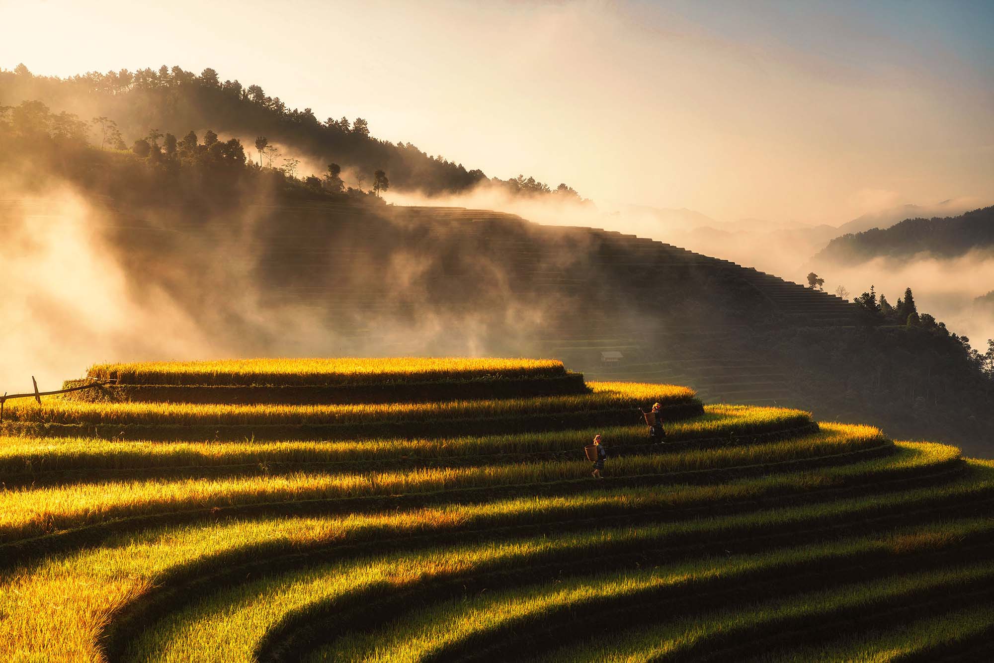
I gained inspiration from Vietnamese nature. Especially the plateau agricultural style that is used in Asia to cultivate rice and coffee. If you look at those fields from bird-eye perspective, you see these very flowy repeating lines which I incorporated in the design. I used elements like coffee leafs and Robusta coffee beans. Unlike the Arabica coffee beans we use in the west, Robusta coffee beans are not oval but round and are roasted longer so that they have a more bitter, rich flavour.
The Vietnamese also drink condensed milk with their coffee, to add an element of sweetness and thickness
to the brew. In Vietnam people tend to take their time to drink coffee and that is translated in the way they prepare a cup of coffee.
Most coffees you'll order in Vietnam will be served with a Vietnamese coffee phin (single-serve coffee
filter), the coffee drips slowly as you take your time enjoying the strong aromas that fill up the room.
Logo
As described above, Vietnamese people take their time to enjoy coffee, I hid the element of time in the logo bu incorporating an hourglass which also resembles a coffee phin. Another element I used is a traditional Vietnamese hat, which the local people wear on the fields to protect themselves from the elements. A lotus flower can also be recognised, which is the national flower of Vietnam.
Animation
This was my very first time animating a logo or illustration. I had no previous experience with Adobe After Effects whatsoever. I remember being nervous about it but I do believe I did a good job, especially with the tight deadline we had for the assignment. If I were to redo it today, I'd change the bezier curves for the easy-ease on the keyframes and I would work on the timing and speed of the elements individually. The liquid element can also be improved but it's a solid start.
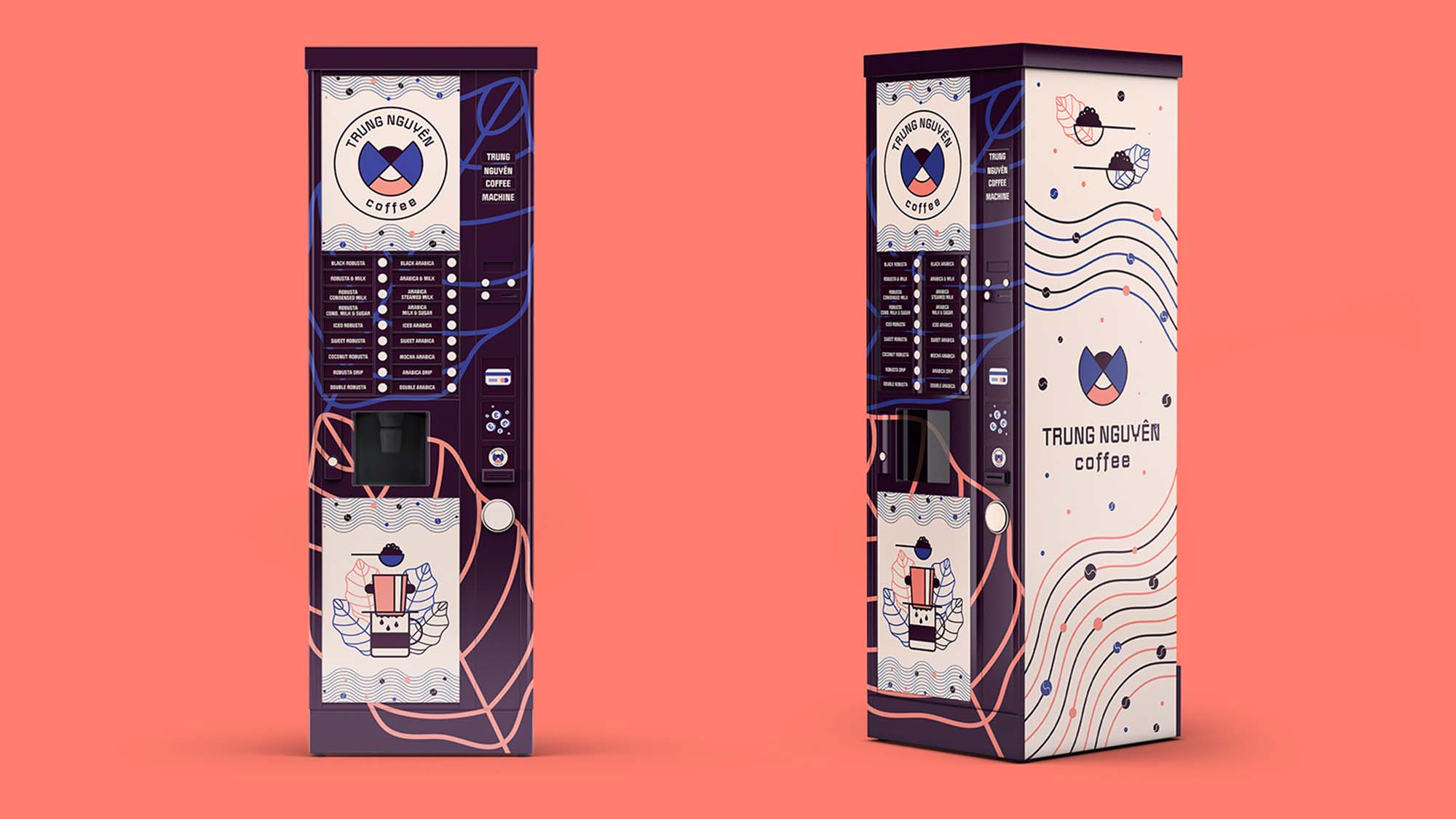
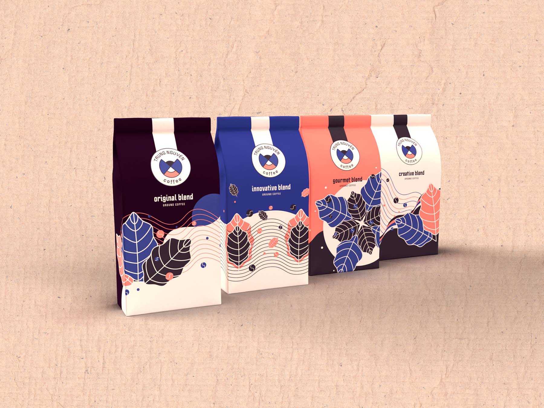
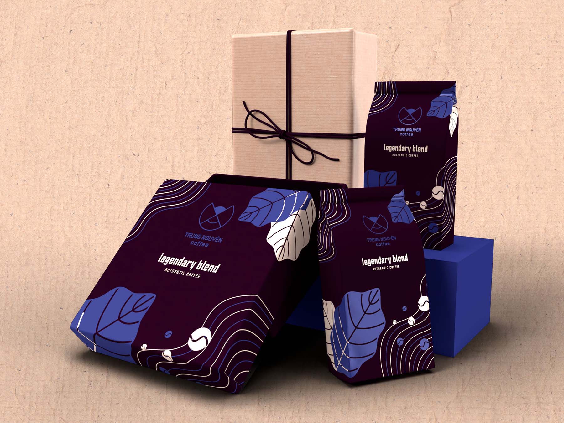
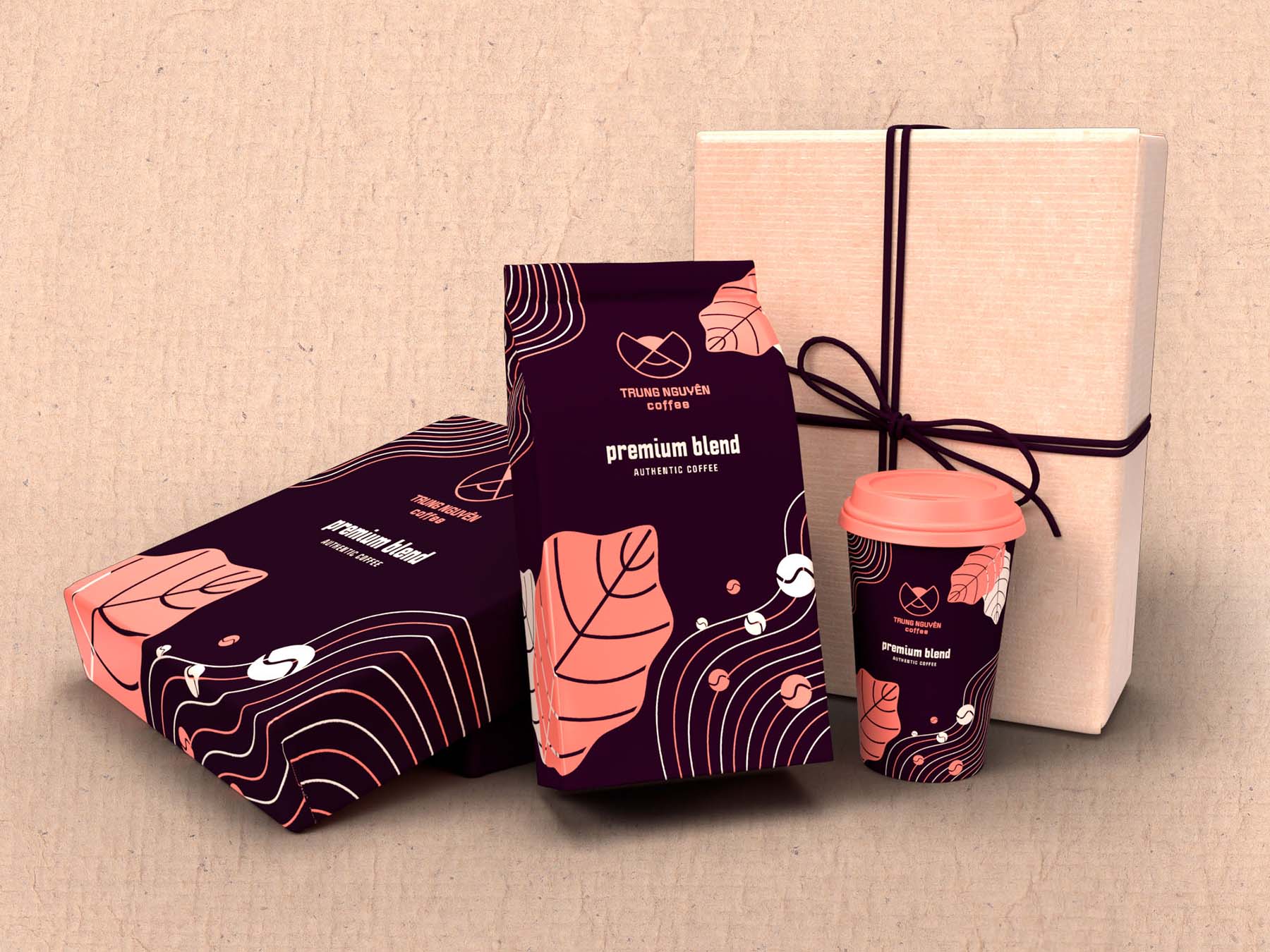
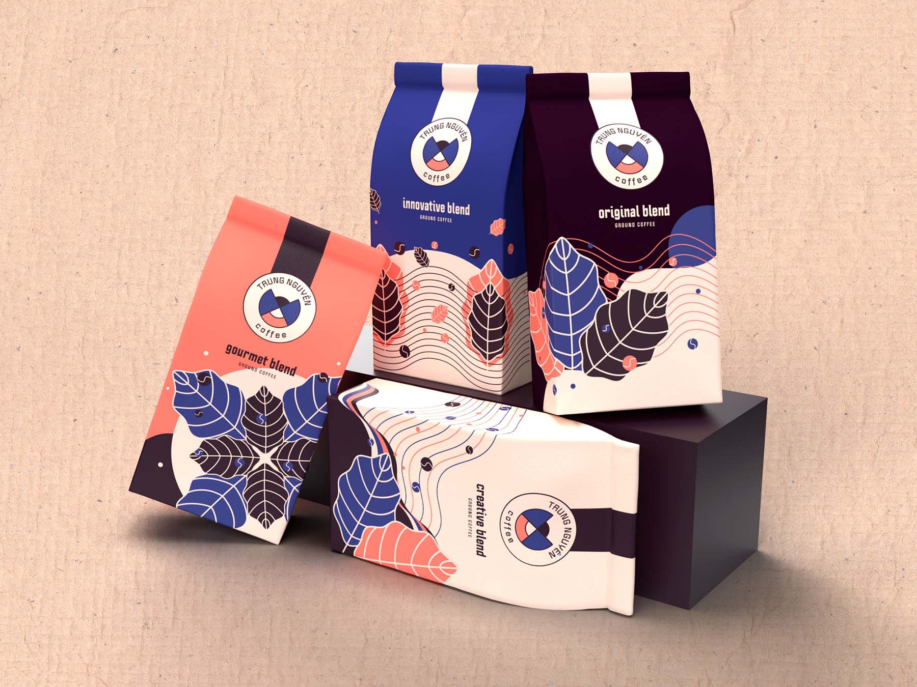
Packaging
Another "first" for me was designing packaging. Since we didn't have to prototype it we could just prepare renders. I used Adobe Dimension for the mockup renders and it was a fun new experience. I had fun creating the different types of coffee inspired by the brand values. I also decided to include a premium line that can be used for gifting. At first I used gold and silver hot foil for the design but I followed the feedback I received and opted for a more "natural" look to enhance the handmade feel of the coffee.
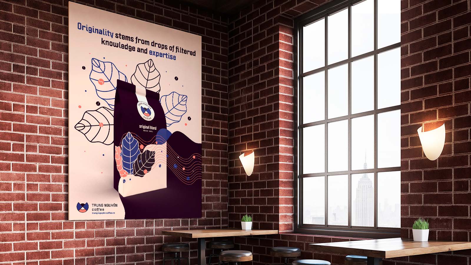
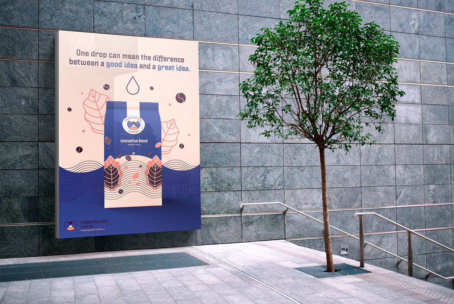
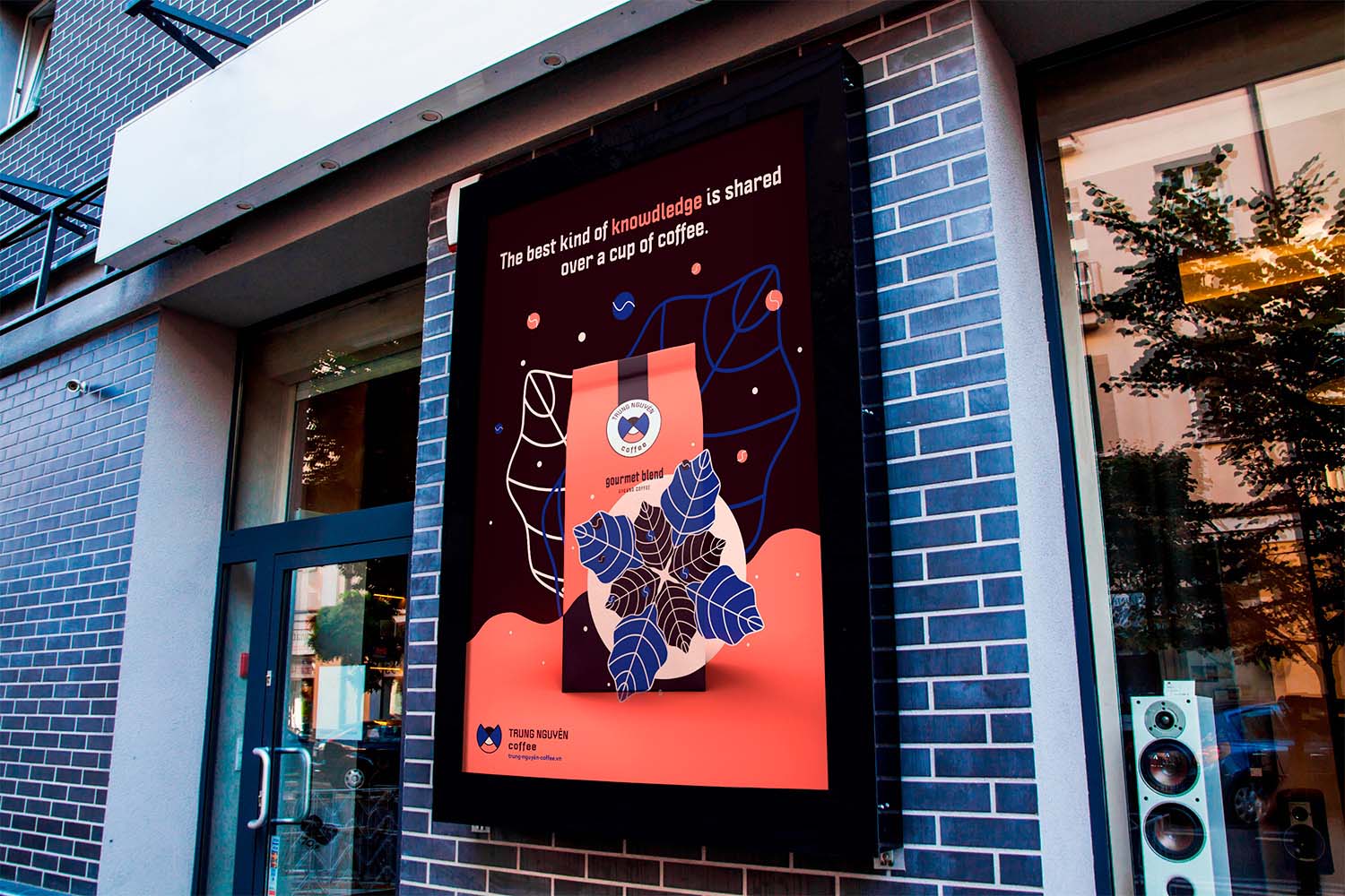
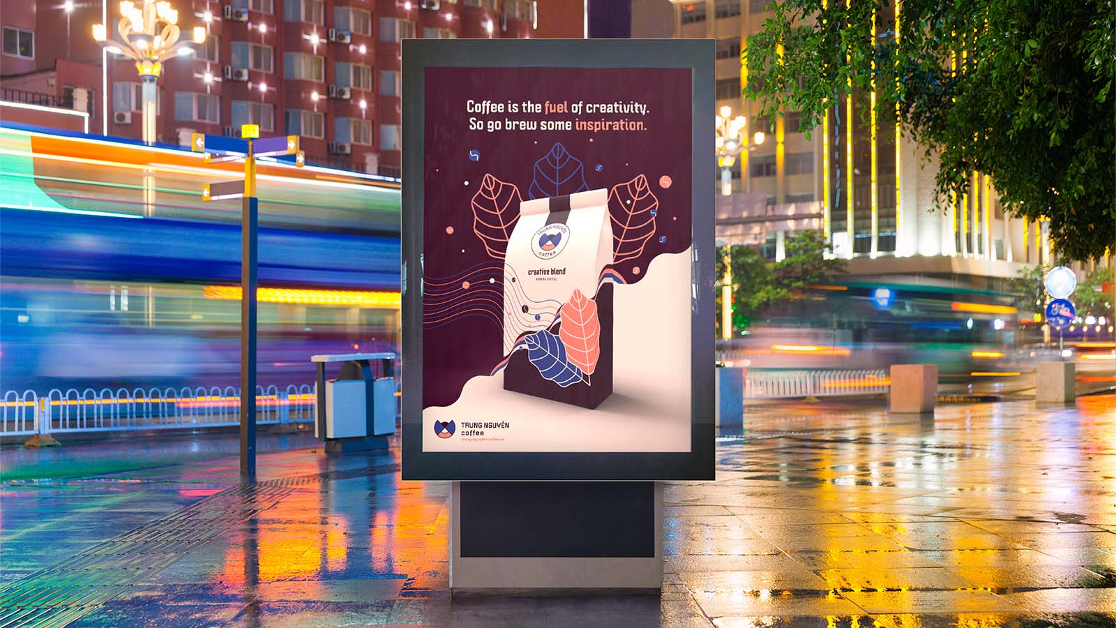
Posters
As for the ad posters for the coffee beans, I used the designs for the packaging to create a seamless transition between the poster and the coffee. I felt that the style and design of the coffee was enough to attract customers, especially since the brand is not supposed to be expensive (except for the premium line). I didn't want to end up with the typical "person smiling at product"-poster. I added quotes supporting each coffee type which perfectly summarise the values of the brand.
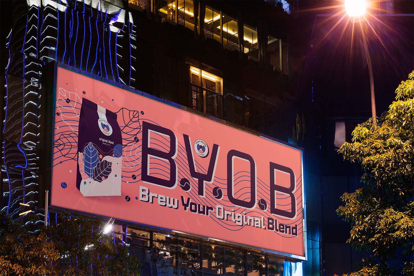
Billboard
The billboard is the element I had the toughest time with and I am sure you can see the struggle since some parts are quite busy. Nowadays I would definitely change it but it is part of my journey to becoming a better designer so I left it as is for now. It does show my potential and how much I have improved over such a short time.
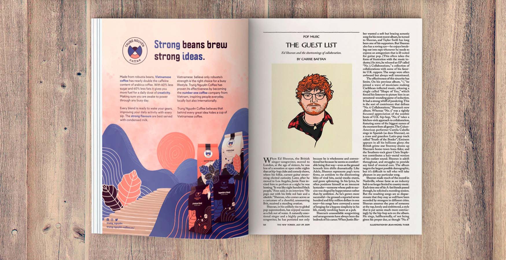
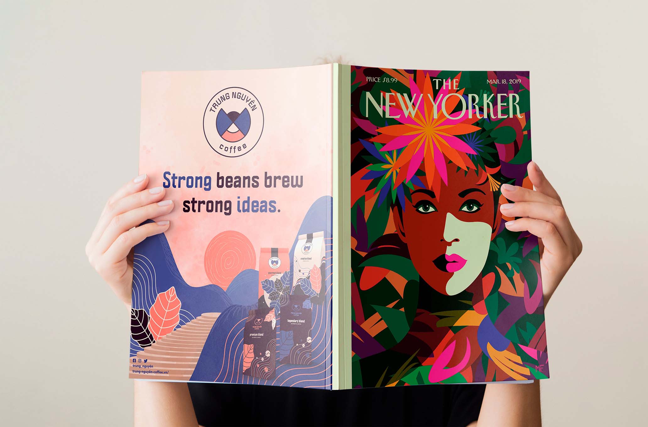
Magazine advertisement
There are two versions of the magazine advertisement. One for the backcover and another for inside of the magazine. I decided to choose the New Yorker as a suitable magazine because I believe the target audience fits the brand best and I wanted to use a magazine that's known internationally.
The visual has a hand-drawn look and feel and contrasts the clean lines used in the other deliverables. The magazine ad needs to showcase the brand and not just the product and since Trung Nguyên wants to focus on the close relationship between nature and humans, I felt it was important to show a more organic side in the illustration.
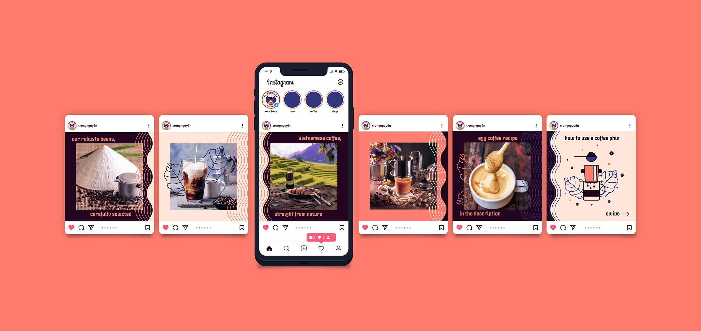
Instagram feed
The templates for social media have 6 different variations and the transition between every one of them is seamless creating a bigger picture. They can be used for pictures or vector illustrations as seen in the example below. I also made an illustration with a coffee phin which can be used for consumers so they know what it looks like and how they can use it.
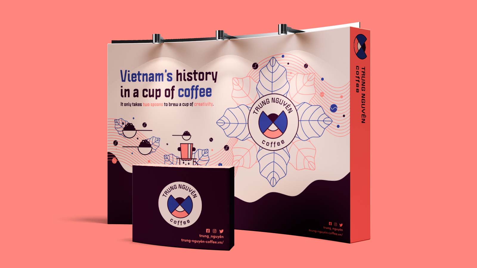
Extra
To add to the brand experience I also made mock-ups for exhibition stands which can be used to showcase the different products and the experience Trung Nguyên provides to its customers. On the exhibition stand it also describes the biggest value of the brand and an inforgraphic-like illustration that shows how the products are used.