2021 // branding
Participation and Collaboration for Action
About the brand
PANDA is an acronym for Participation and Collaboration for Action. As a project during my last year in
college we would work with real life clients to create a better understanding of our skills as a
designer. I was teamed up with Tilde Ronsse and together we received the briefing for creating a
branding for PANDA.
According to their website, PANDA Project seeks to promote the participation of young children (aged 12
years and under) in
decision making through strengthening professionals’ collaboration with young children involved in
child welfare child protection services. The definition alone is quite difficult to grasp but PANDA
wants to support social case workers by providing them knowledge that they can use to help children
improve their living and home situations. The end goal is for the case workers to give the tools to
children so that they can make the best decisions fit for their situation.
The project is international so it is important that the information source (PANDA) is also adapted to
the different cultures. The reason why PANDA project was created was because of the differences in
collaboration between social case workers and children in different countries. PANDA Project wants to be
the go-to source for social case workers to receive proper and cross-cultural information, that way the
information available can be streamlined and less fragmented over the internet.
We knew it was going to be a challenge since we were only a duo tackling a whole branding and responsive
website in multiple languages. Luckily we are both very hardworking, we don't shy away from a challenge
and in just a few months we finished the branding. The satisfaction from receiving high praises from our
teachers and most importantly our customer made everything so worthwhile.
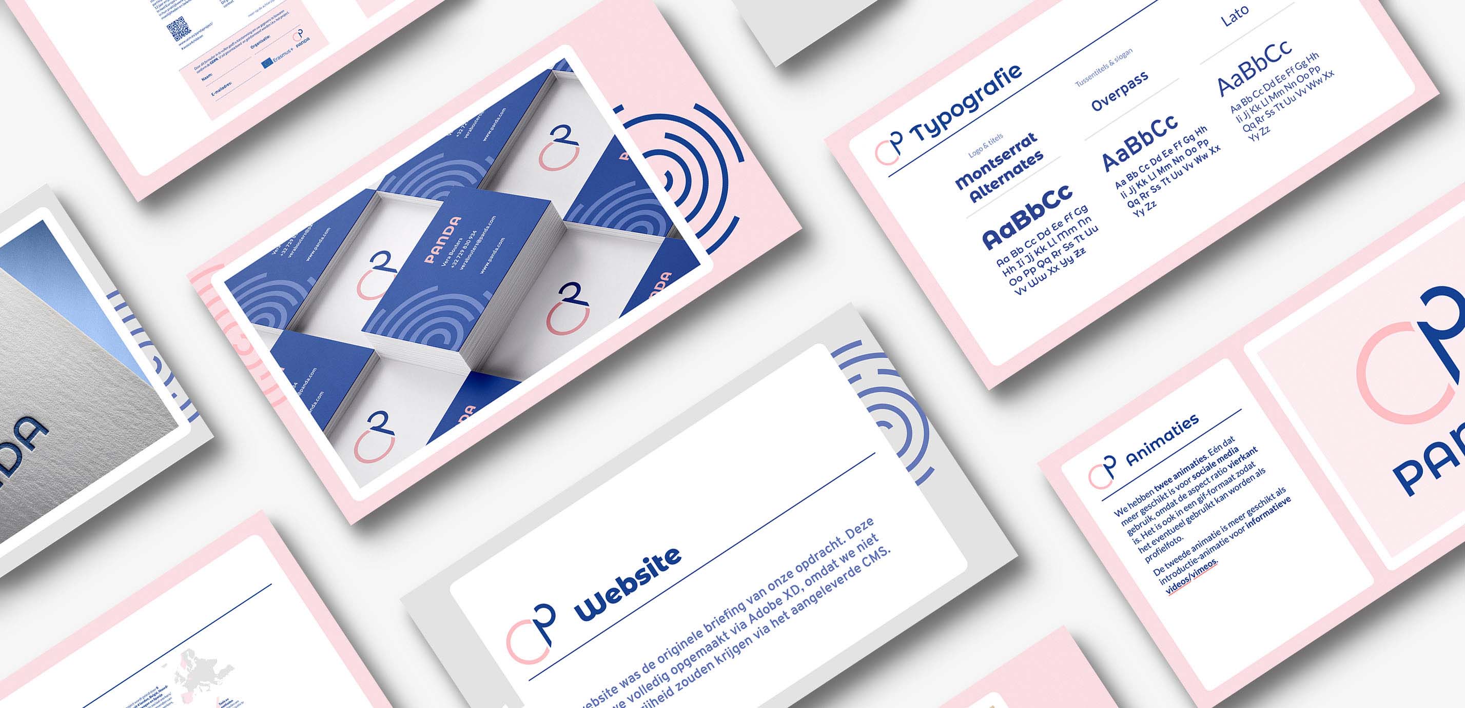
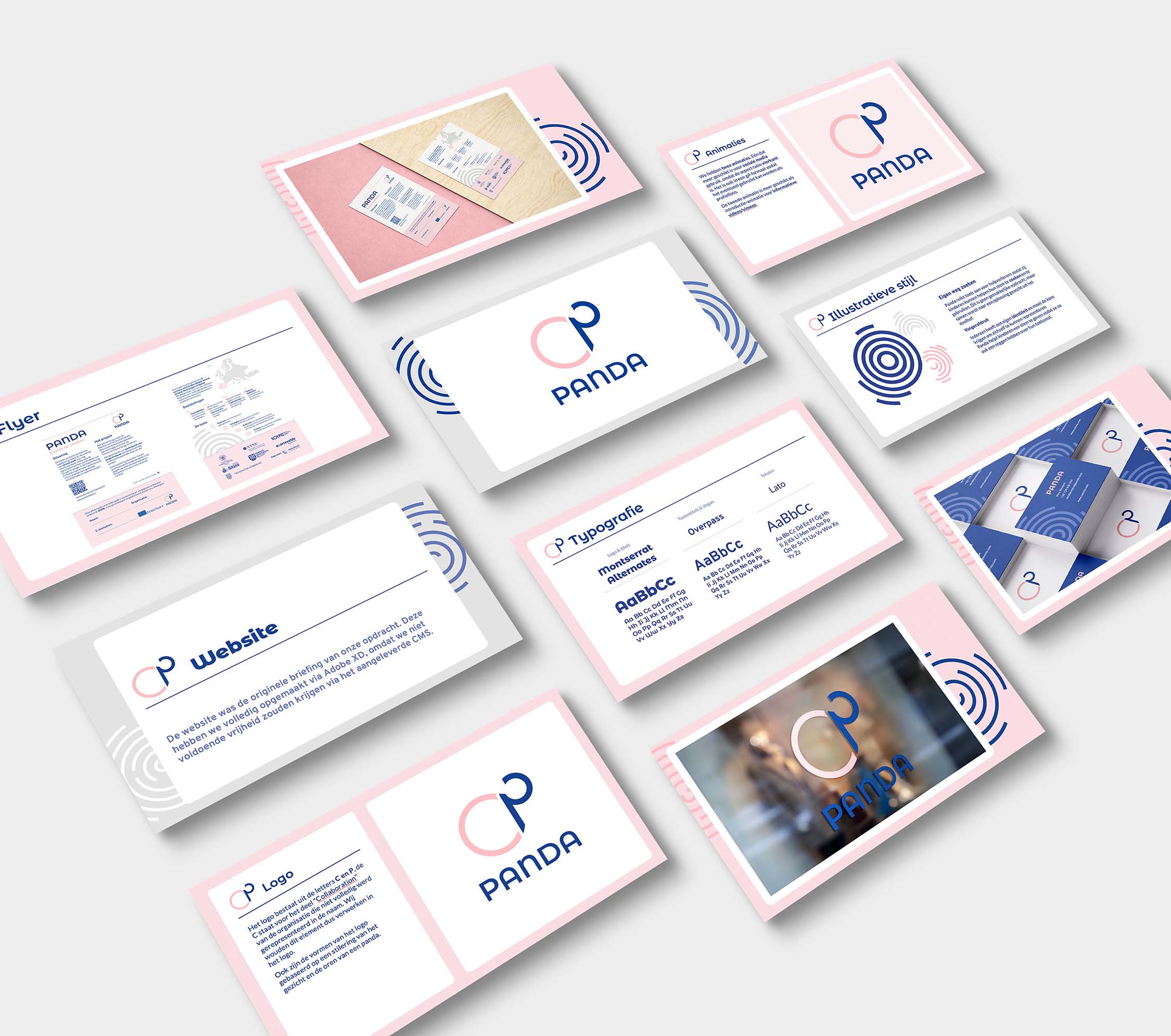
Logo
Since our knowledge on the subject wasn't so broad we decided to work a bit closer with our customer
than we would normally do. They also wanted to be involved a bit in the creative process so that they
could understand our design decisions better. We had a few brainstorm meetings in which we would show
them our ideas and build further on them. The most important part was that the message we wanted to
portray was visualised properly.
We had a few solid options for the logo but our customers chose this logo. They liked the idea of the
focus on the "C" since its absent in the acronym. Collaboration is the leading factor in the PANDA
project so they needed it to be represented visually. The combination of the letters "C" and "P" are
actually inspired by a panda bear. We didn't want it to be the focus so it's in fact very stylised.
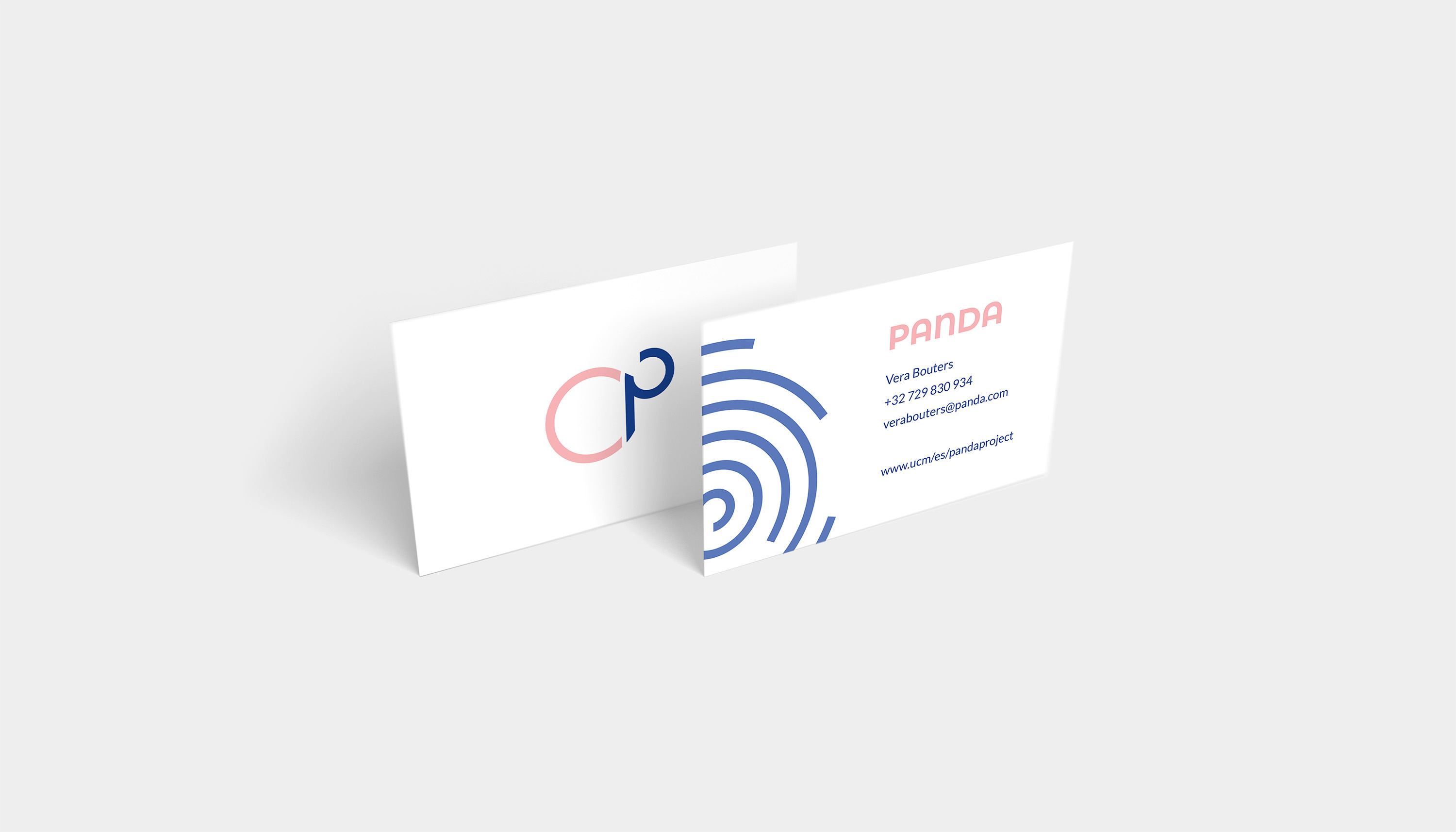
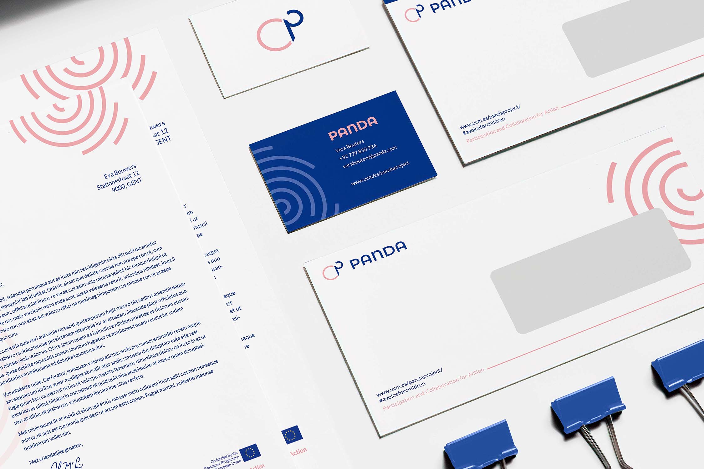
Business card
The visual elements on the business cards and also on the other deliverables refer to circles, a
labyrinth and a fingerprint. The circle symbolises security and unity. Unity gives people confidence and
is associated with connection. When a group of people want to discuss something regarding the solidarity
of the group, they automatically sit in a circle, preferably all equally distanced from the center.
The labyrinth showcases how PANDA wants to support case workers that help children find their way
through their struggles. The fingerprint represents how everyone has an identity and how every child
must be given the opportunity to represent and justify themselves when making choices. PANDA helps to
give children a voice so that they can have a say about their own future and strengthen their identity
long term.
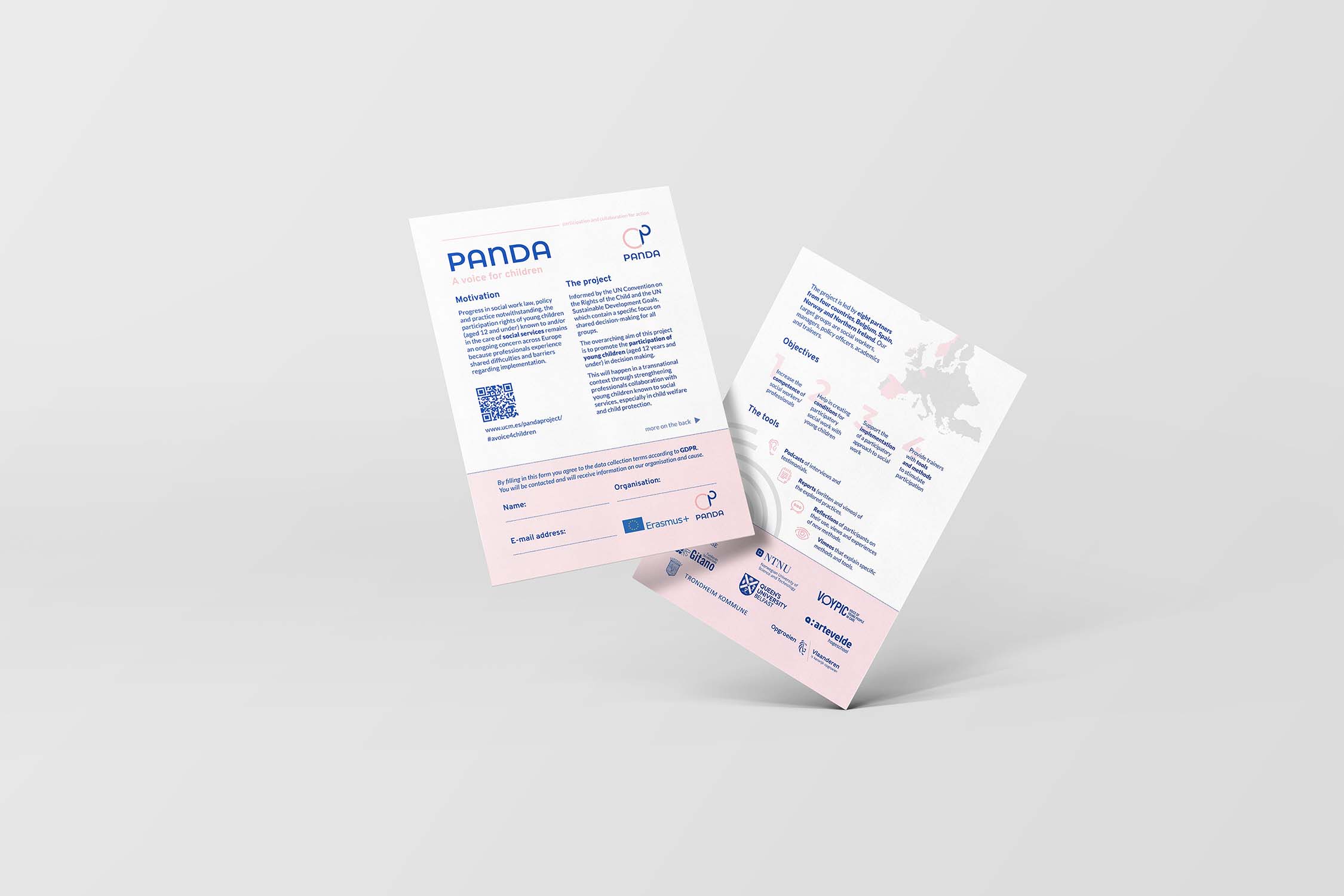
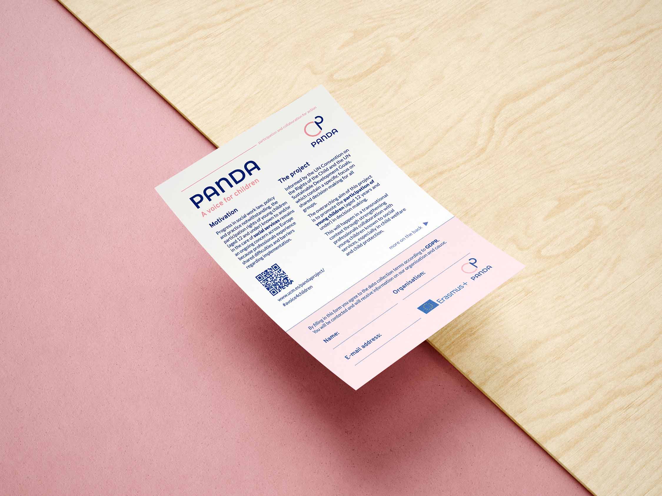
Flyer
When designing the flyer, we used a grid of 6 columns and / or 8 columns. When making the different
language versions, we deviated slightly from the grid, especially with text and objects that have been
placed freely within the design (see for example “tools” and “objectives”).
Languages do not always have the same word ratio, which is why we deviated a little bit throughout the
languages but we made sure the
overarching style is the same. We designed a few icons that represent every element that PANDA provides.
Again, the circles are used as visual interest and all the logo's of the partners are on the flyer. We
asked consent to use the PANDA colour palette before applying it to the logo's.
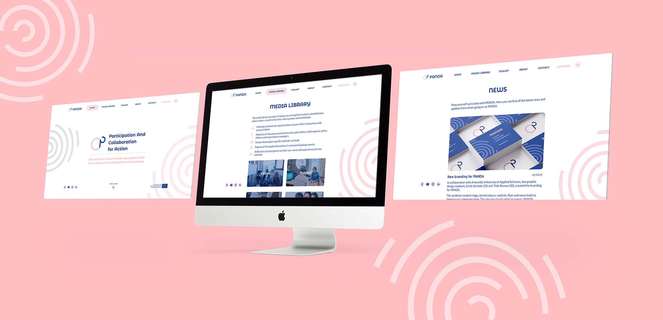
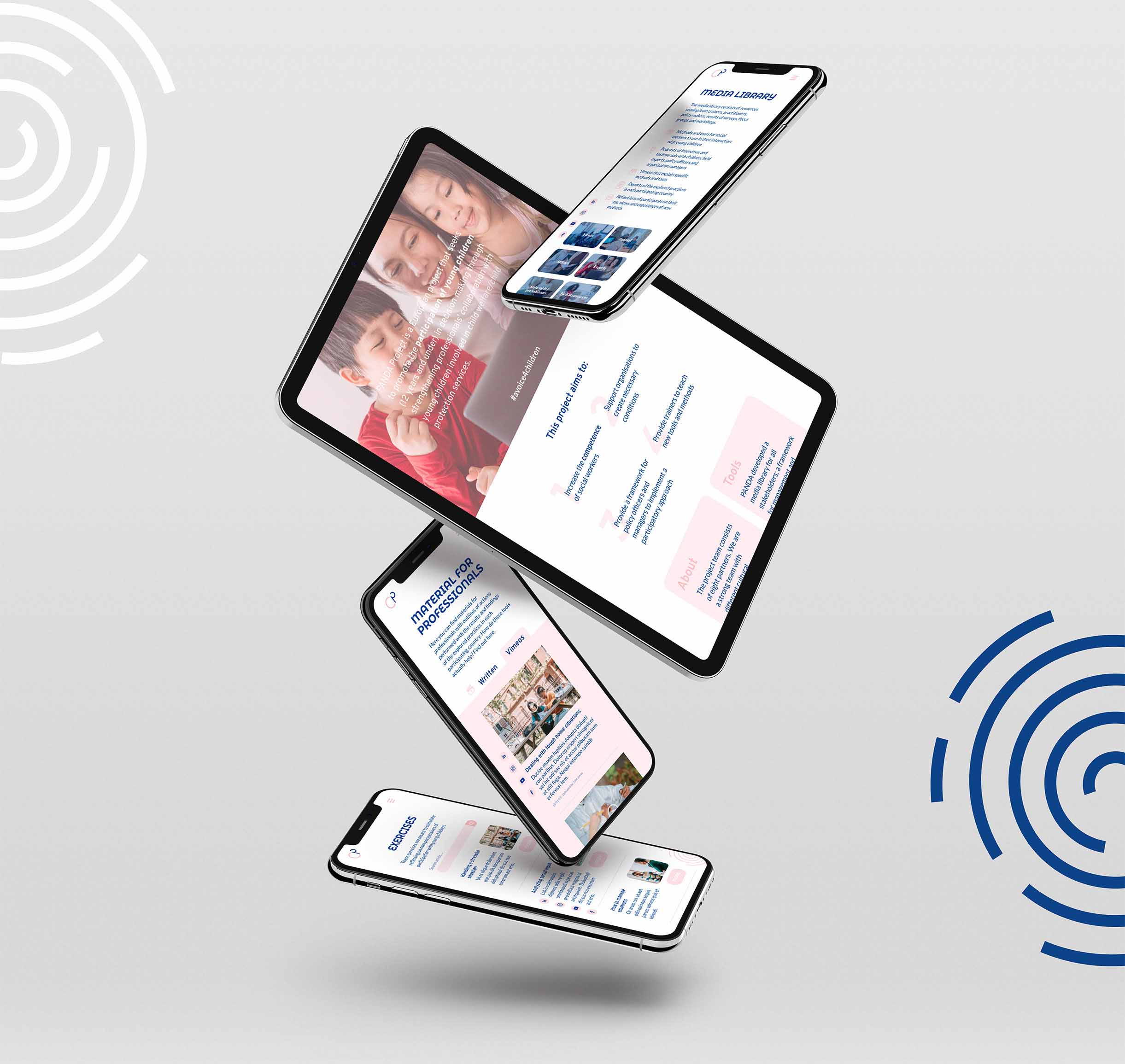
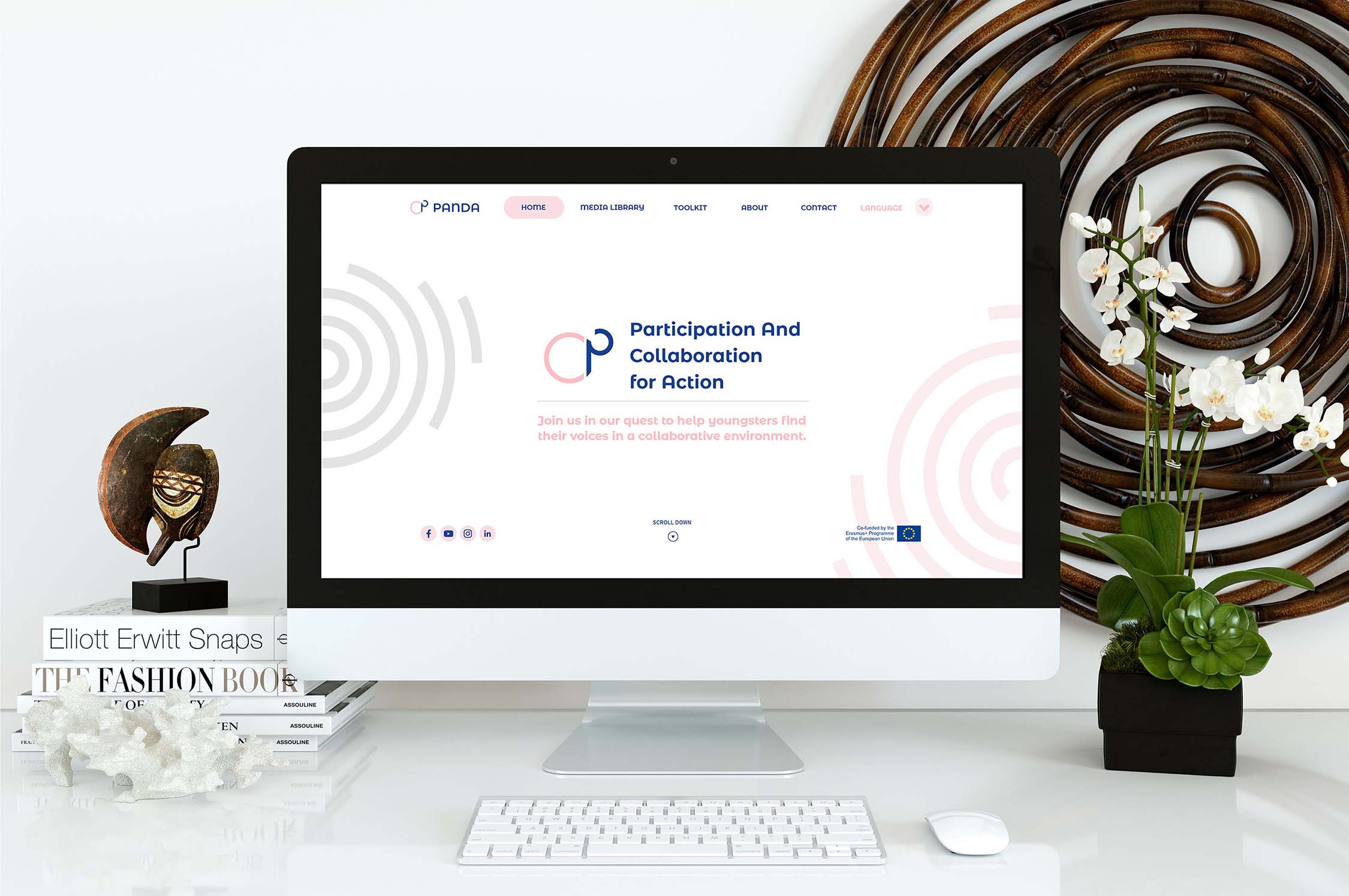
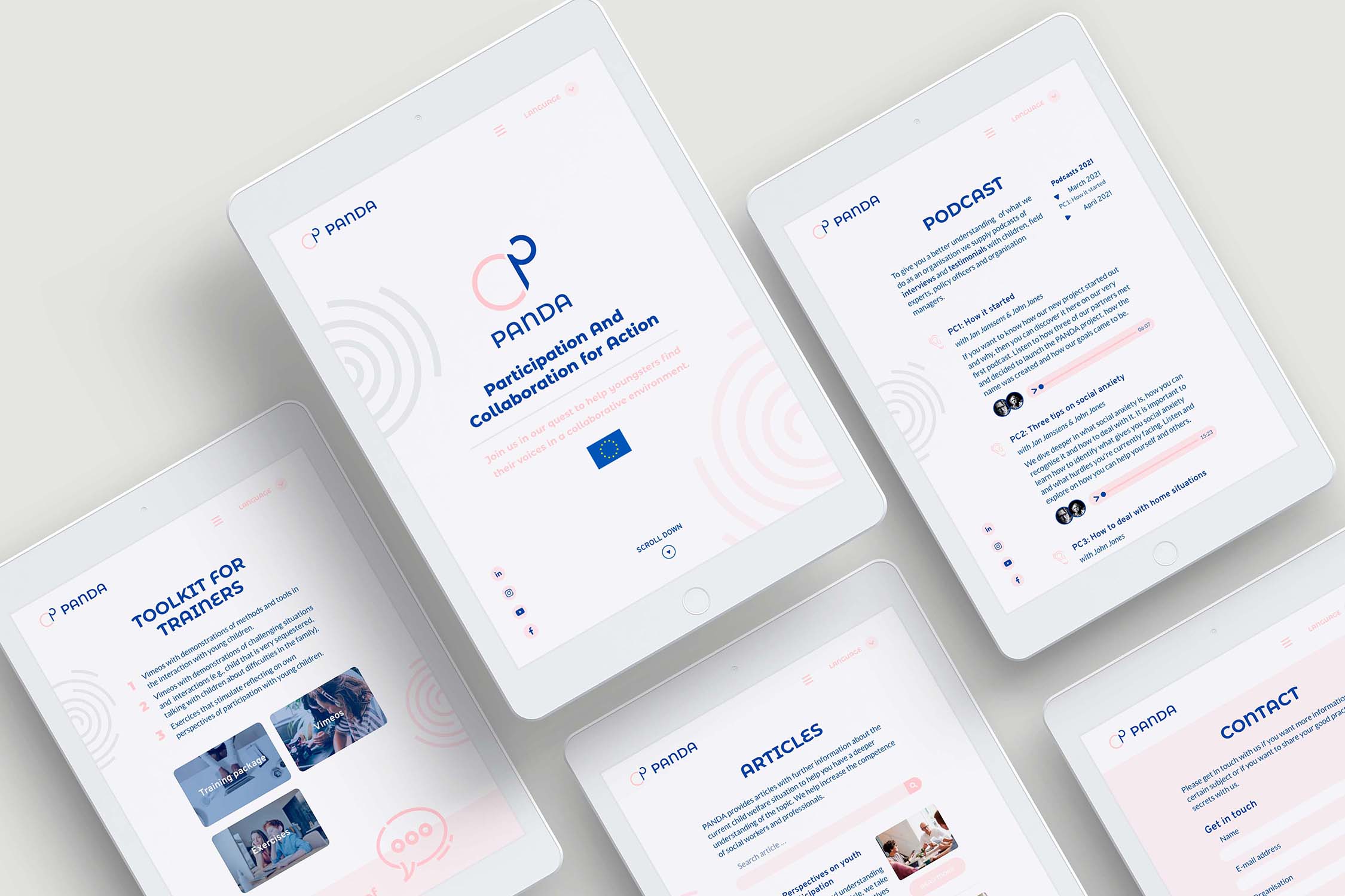
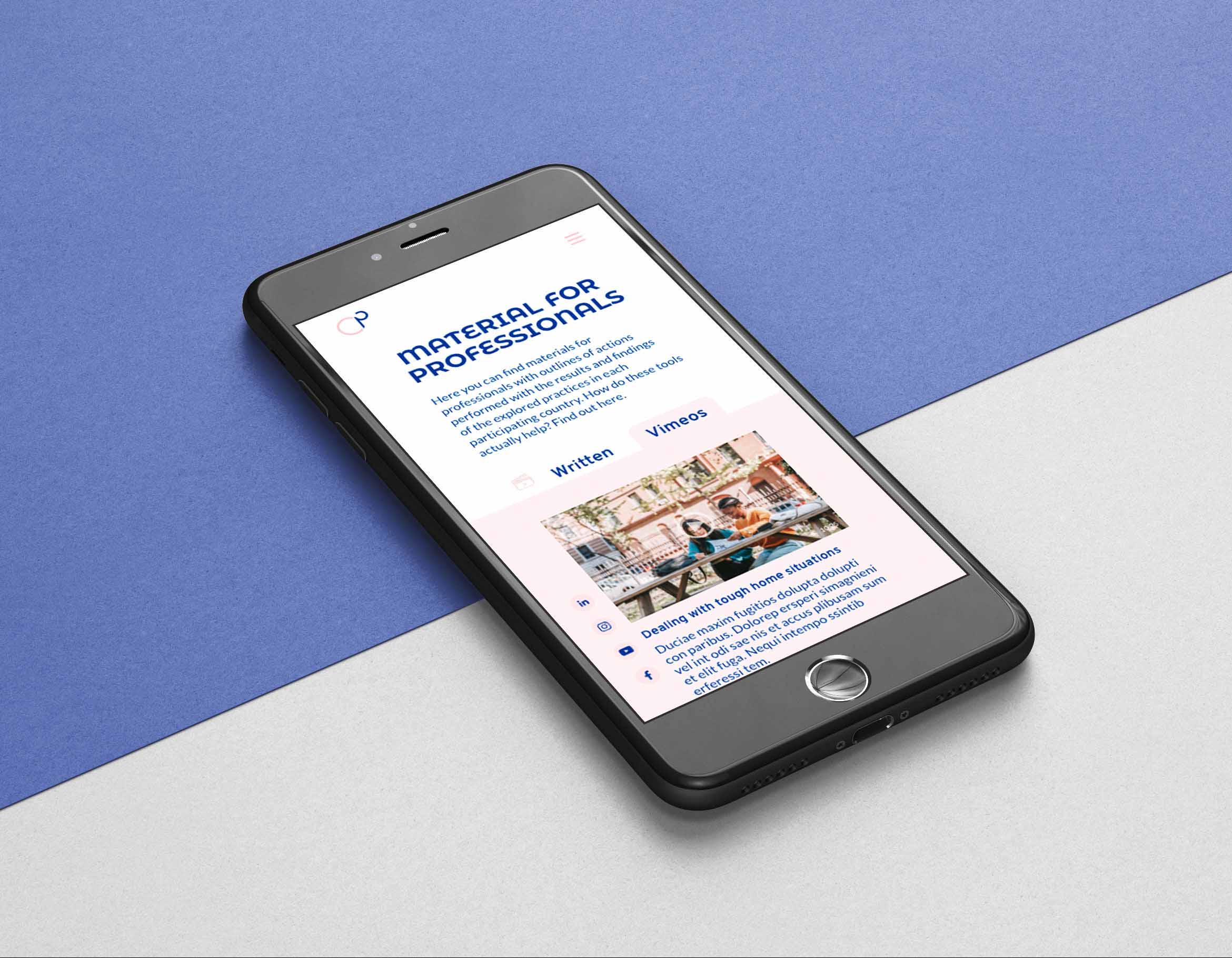
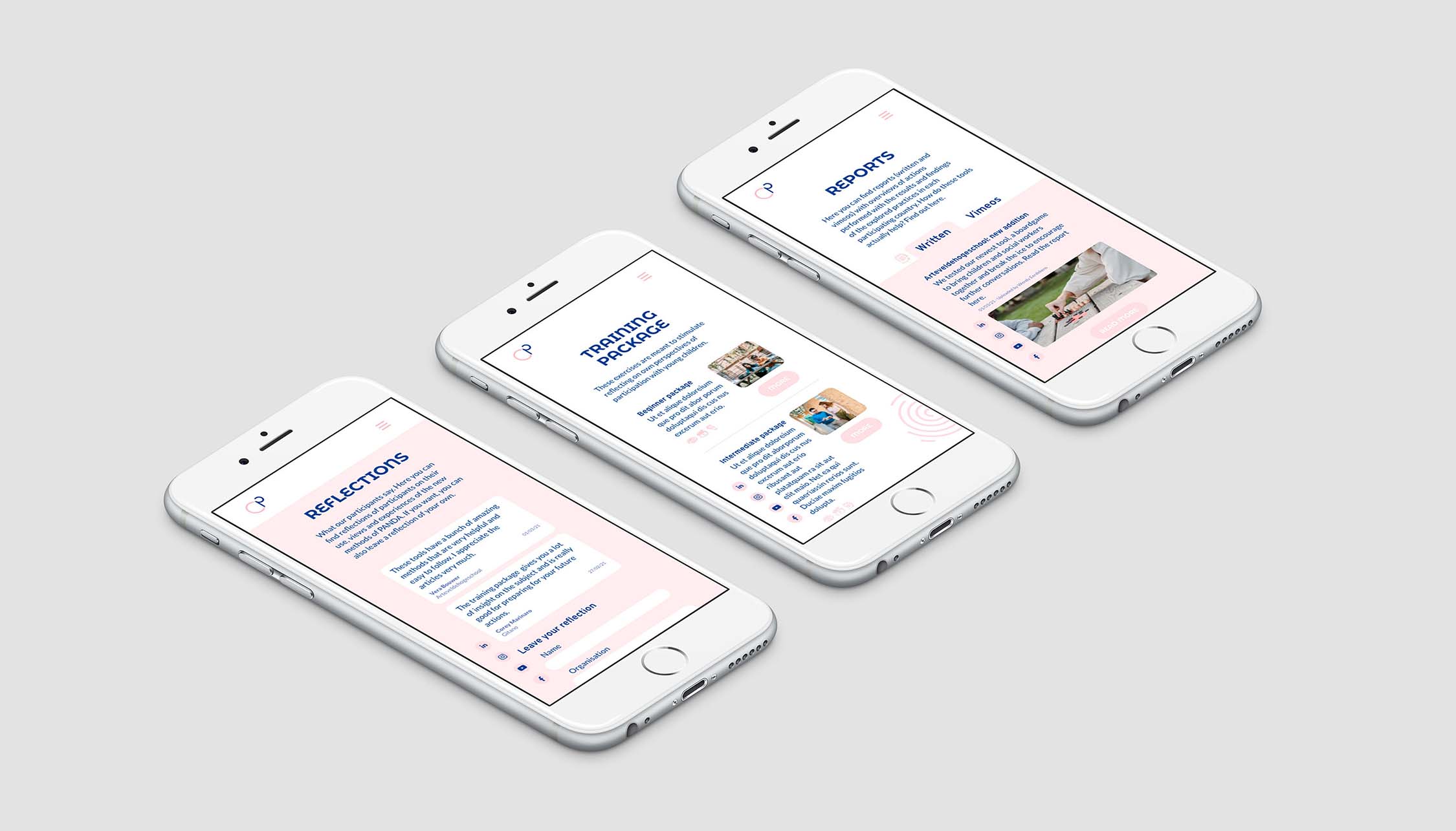
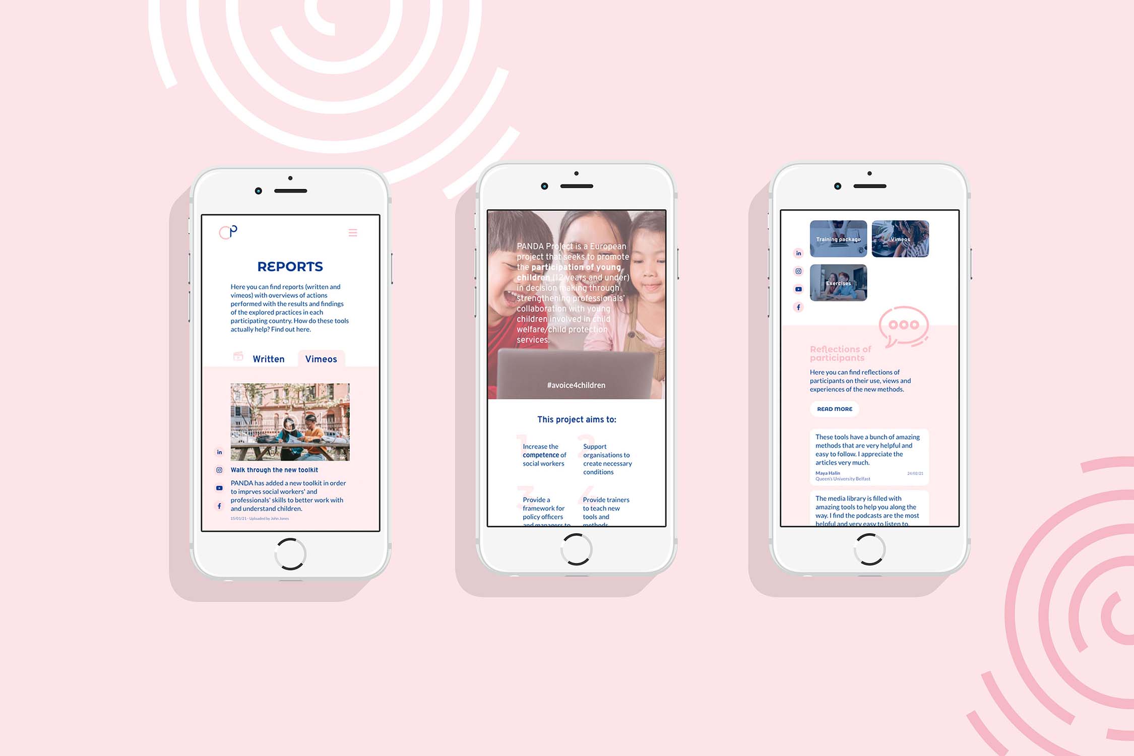
Website
As part of the briefing we had to create the website. We built it using Adobe XD. Unfortunately our
customers couldn't use the visual design of the site because a partner of PANDA already prepared a page
from their website to use for the project. Since it followed a pre-existing CMS we coudldn't showcase
our creative designs so we agreed on making a mockup through Adobe XD so that we could at least show
what we would've done if the website would be made from scratch.
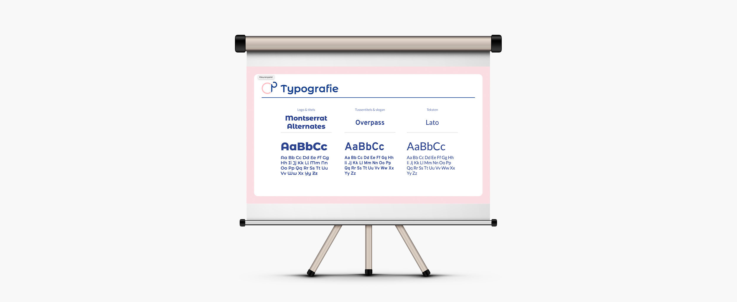
Following the fontstyles from print, we also used Montserrat Alternates and Overpass for titles and Lato
for the body text. We have also used Montserrat Alternates for the menu-buttons because it is, next to
the logo, the most
clear reference to the brand. The menu is used a lot so it is needed that it represents the brand as
much as possible.
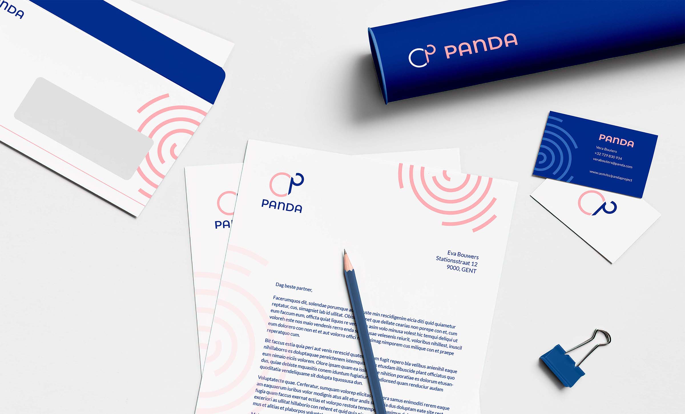
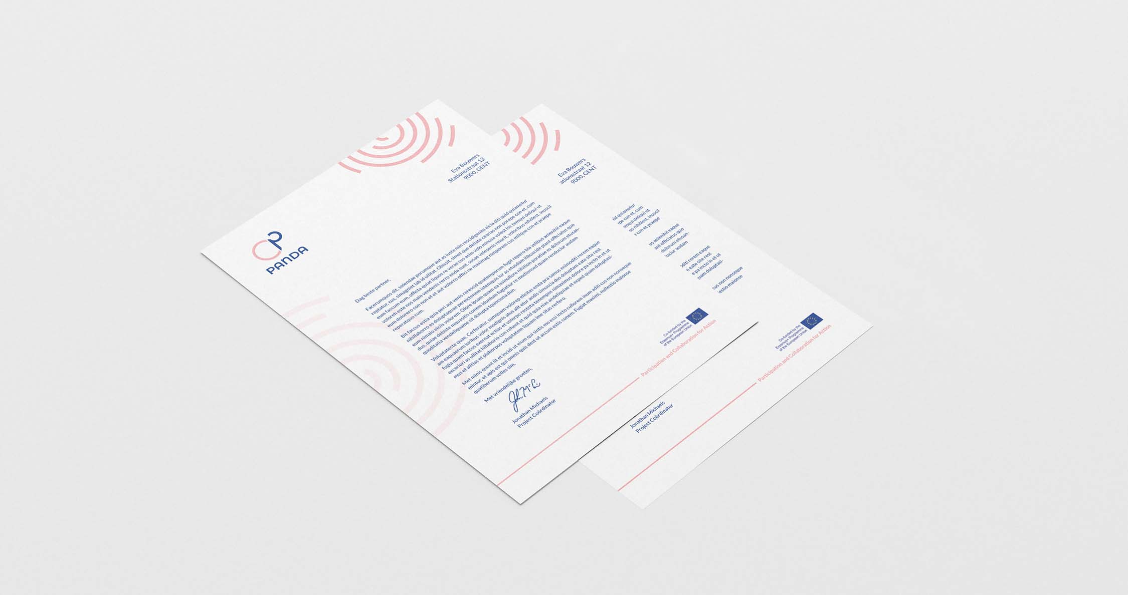
Stationery
The organisation consists of educational partners, it is important that they can communicate through print and letters so we also prepared some stationery items they can use to exchange word with social case workers, partners or educational institutions to further enhance the strength of the visual identity.
Presentation
As an organisation that seeks to educate, it's important they can with the proper (visual) means. We thought it was thus very important that PANDA's visual image is also represented while informing during meetings, congresses, conferences, etc.