2023 // branding
A wavey branding for digital agency, Wisemen
About the brand
When I hear the name Wisemen, I automatically think of older men in suits. However, what Wisemen truly is, is completely different. Not only men walk around the office, and the employees are more than just wise. The name does not align with reality, and that is also the theme of the branding. Wisemen's name is a facade for the experience that follows. The employees possess so much expertise and wisdom that they create their own rules and challenge the status quo. Wisemen doesn't take itself too seriously, which promotes creativity and generates innovation.
The following brand assets also reflect that rebellion towards its own name and the usual way of doing things in the industry. Wisemen dares to question itself to evolve and improve. The employees also do this with their clients' ideas to encourage innovation and bring new solutions to the market (and do so the fastest).
Logo
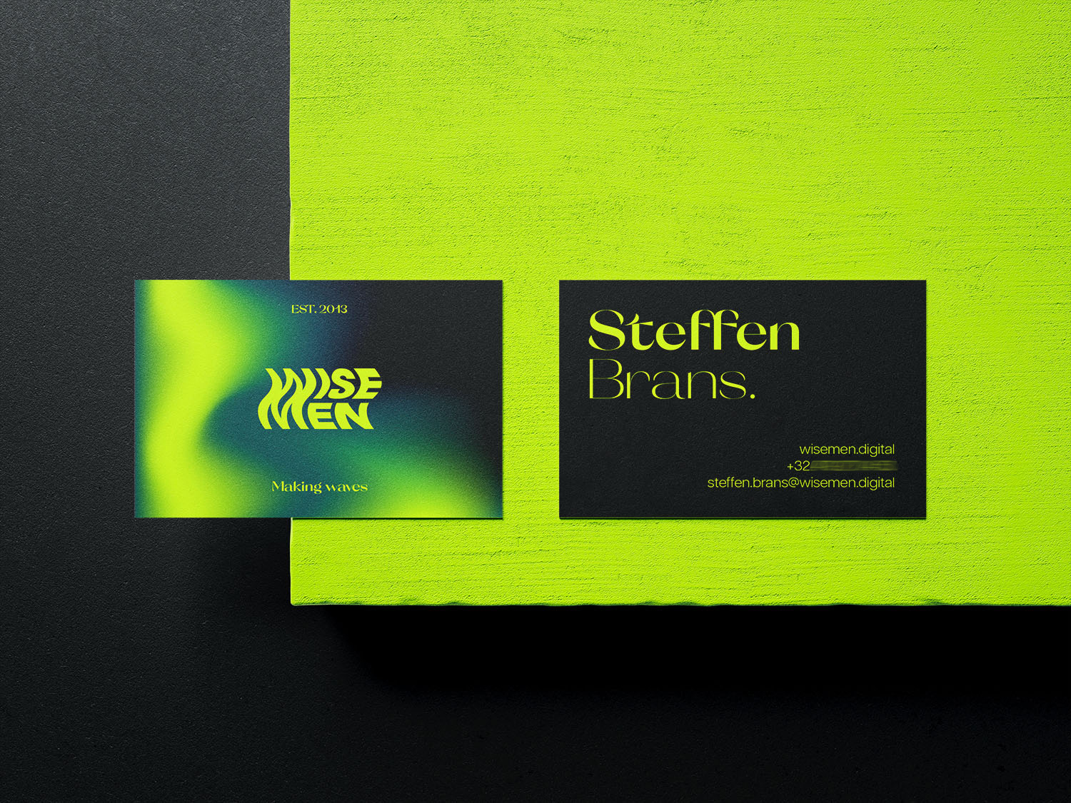
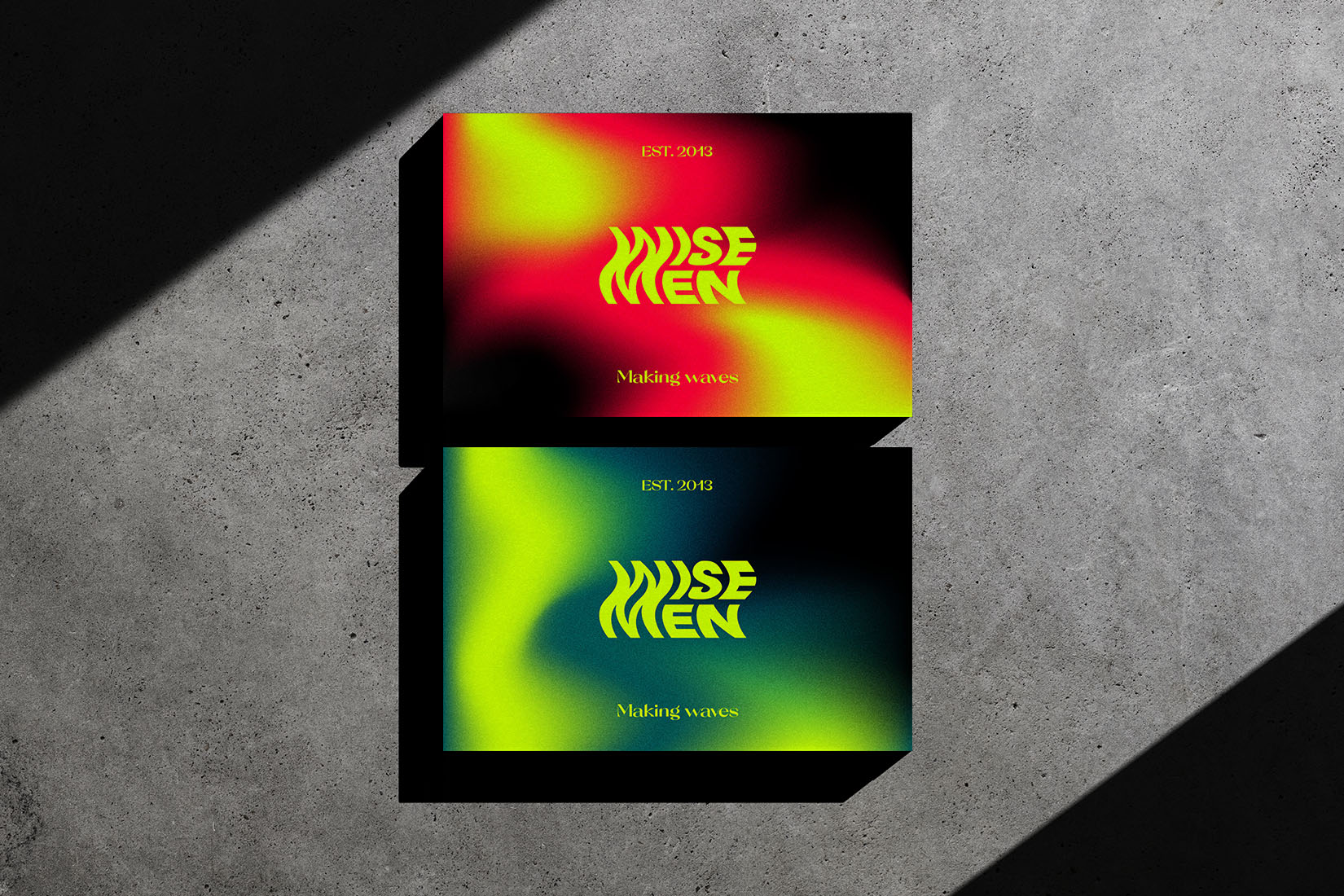
Wisemen's new logo includes a few overarching sources of inspiration matching the new tagline "Making waves". In the logo we see a wave, a flame and 3 shapes that represent the WM. The waves indicate evolution and change. Distorting the name signifies the rebellious side of the brand. The three shapes represent the three services that Wisemen offers. The general shape is a flag, as they are the pioneers of the fleet (the market) and bring innovation. A flame symbolizes the passion the employees have for the company and each other.
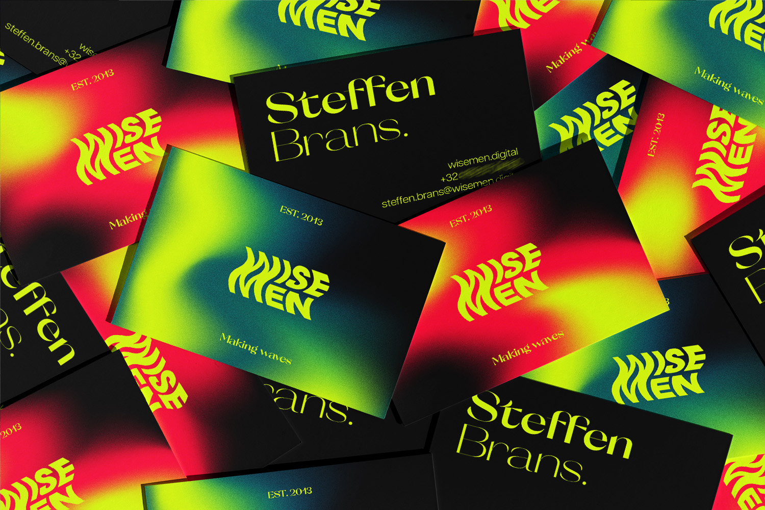
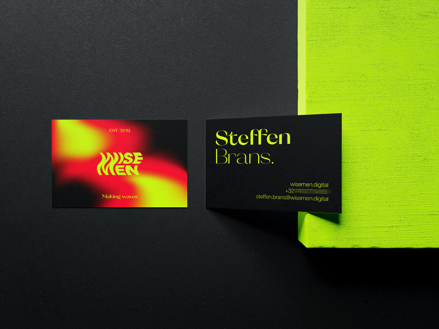
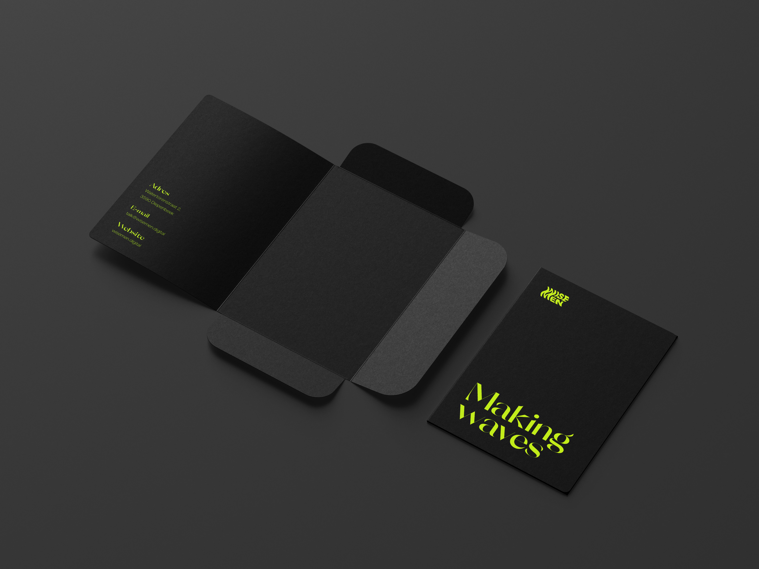
Business card
In an earlier version of Wisemen's new visual style, I included two gradients that accentuated the official colourway. Both gradients reflect Wisemen's two sides. The innovative side that always seeks to be the best and reinvent itself, and the rebellious side that wants to defeat current norms with daring techniques, confidence and a touch of competitiveness. Unfortunately the gradients were scrapped from the branding because later on I discovered it wasn't fitting in with Wisemen's communication style.
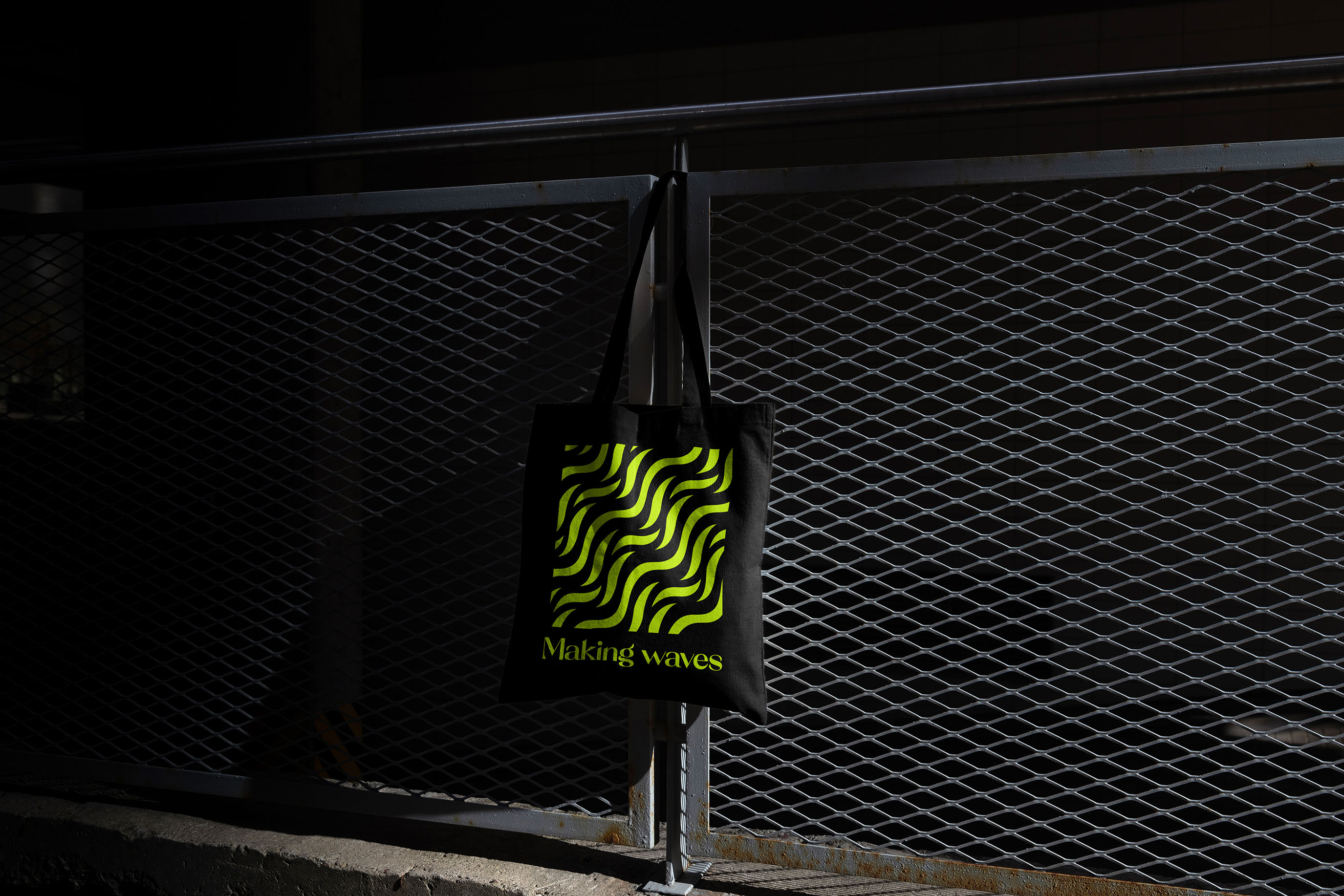
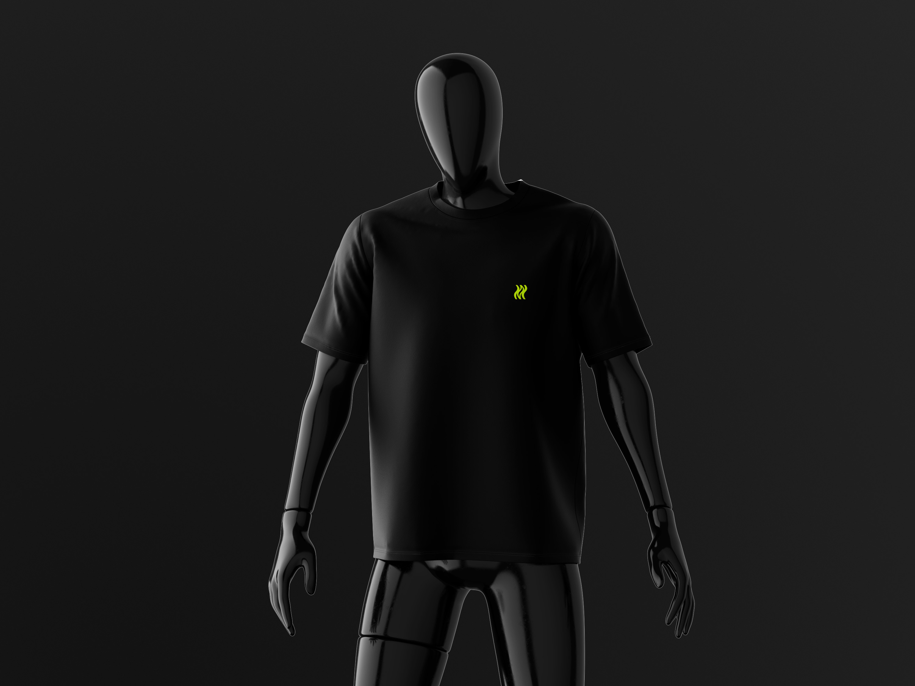
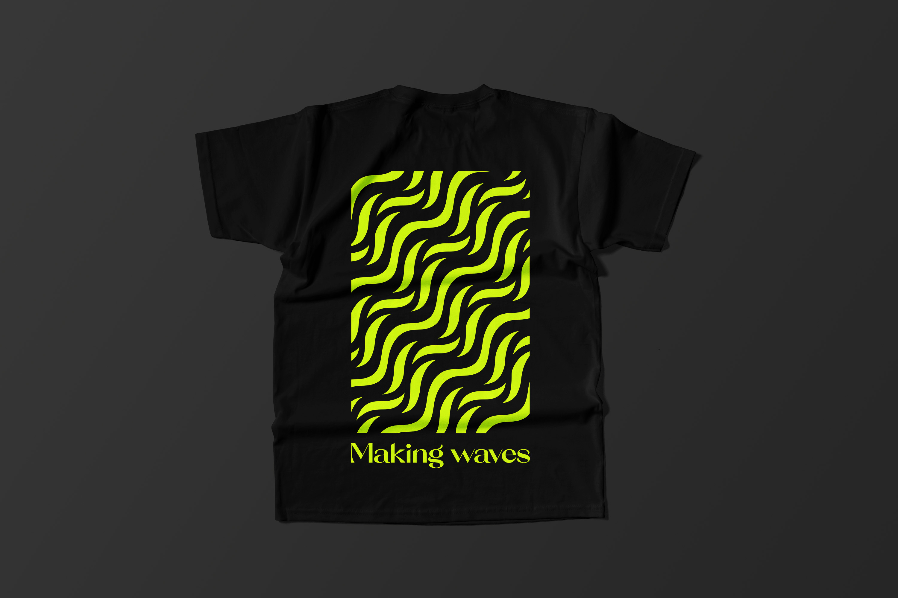
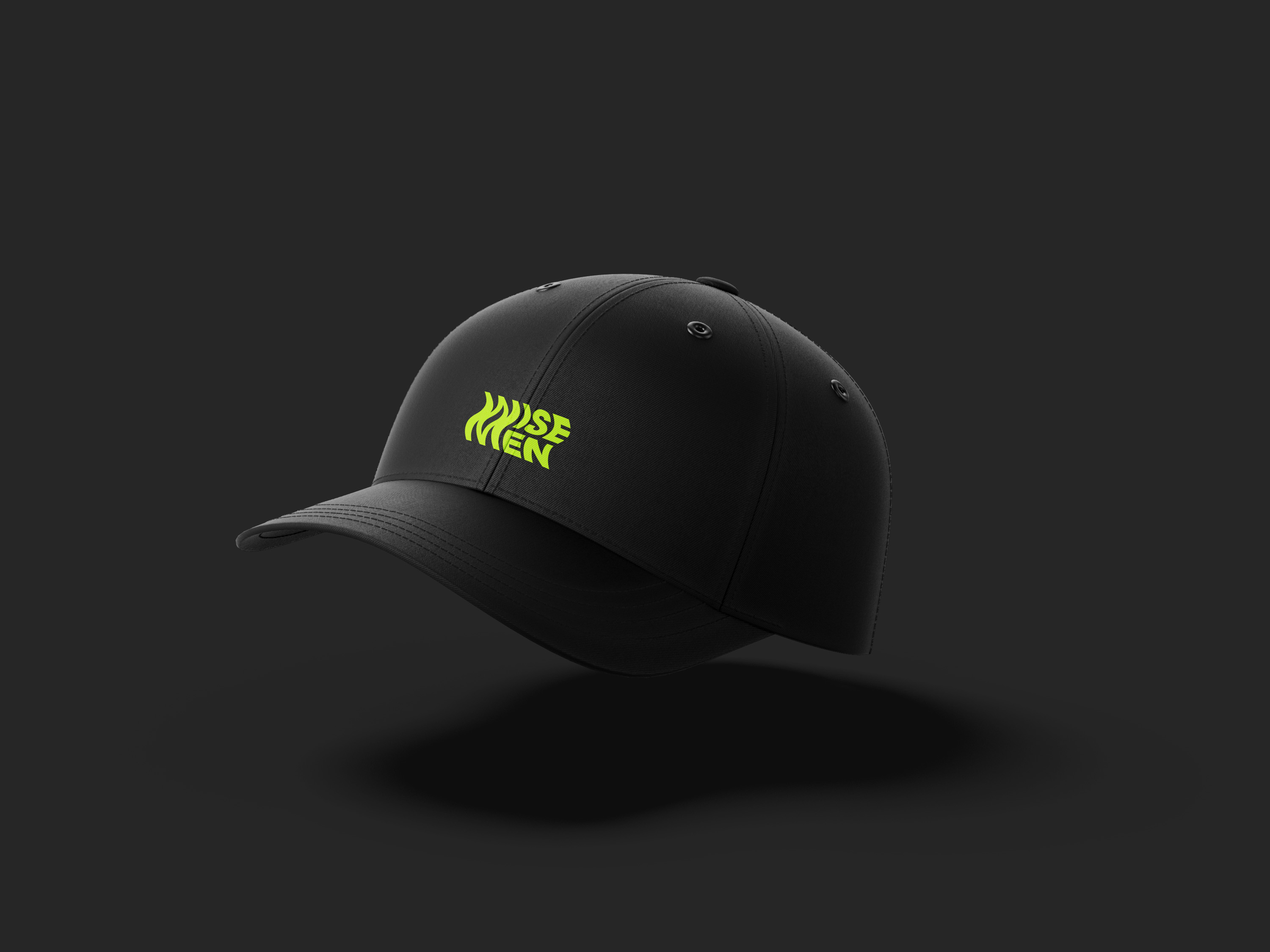
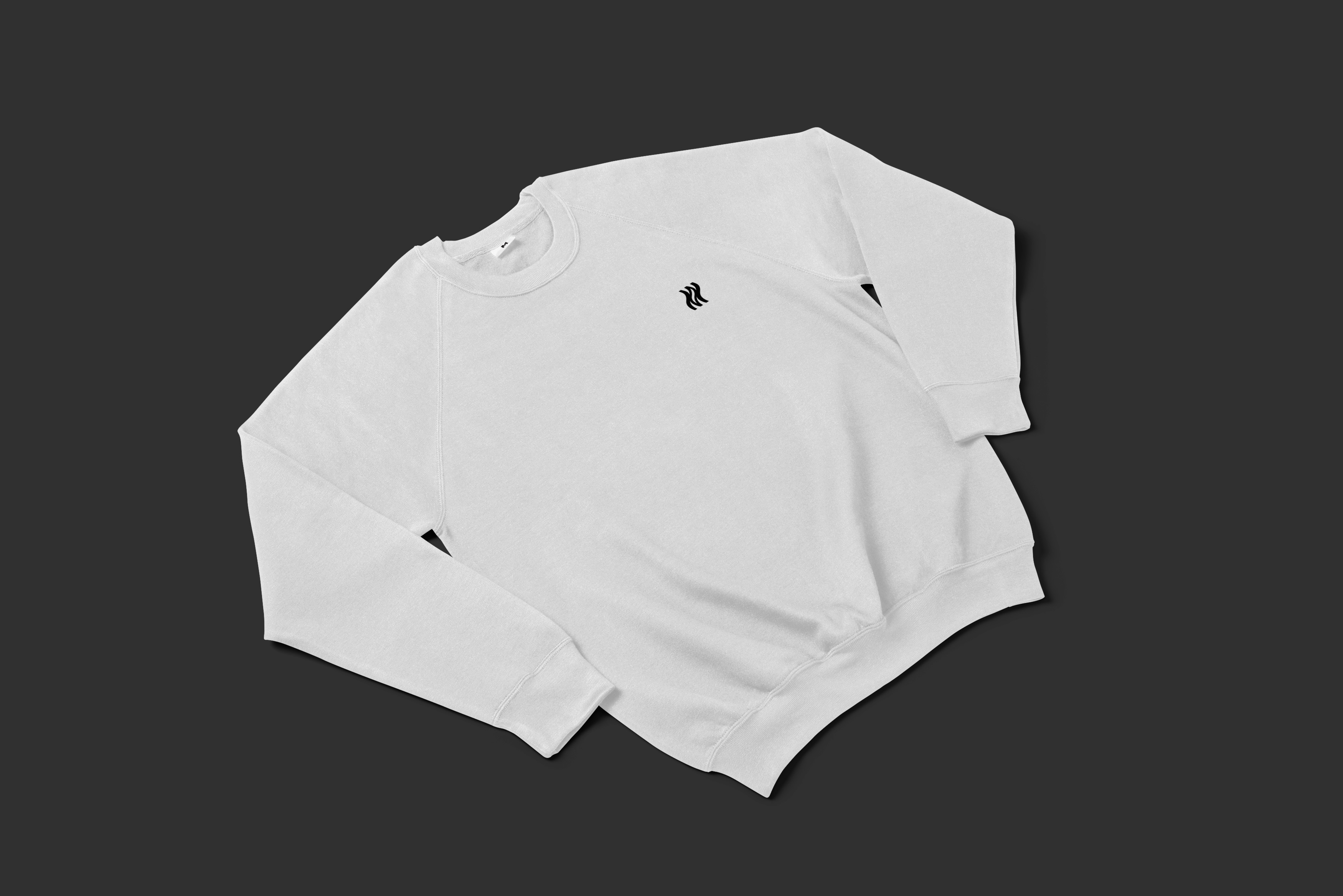
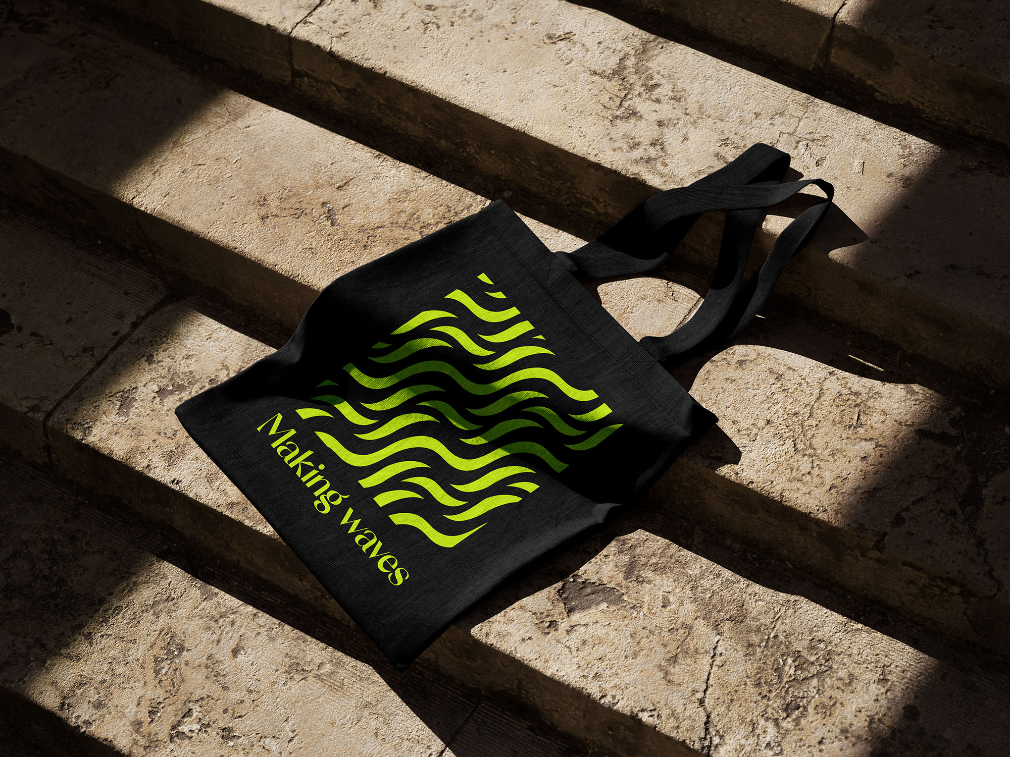
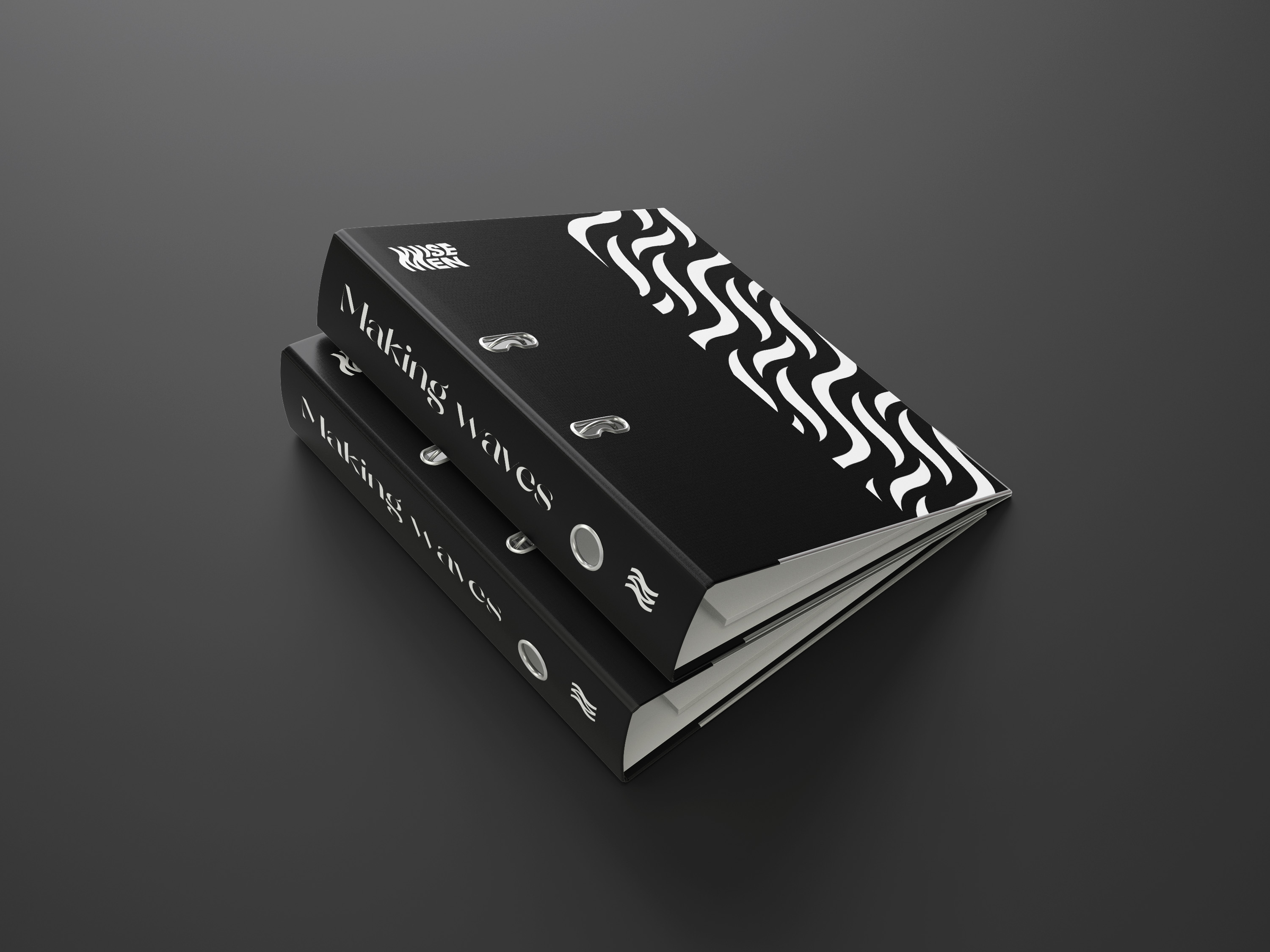
Apparel
When designing the apparel for Wisemen, I got inspired and fine-tuned the visual style. Everything had to be executed swiftly, and it was during the creation of the distinctive motif that the brand truly reached its fully accomplished brand identity.

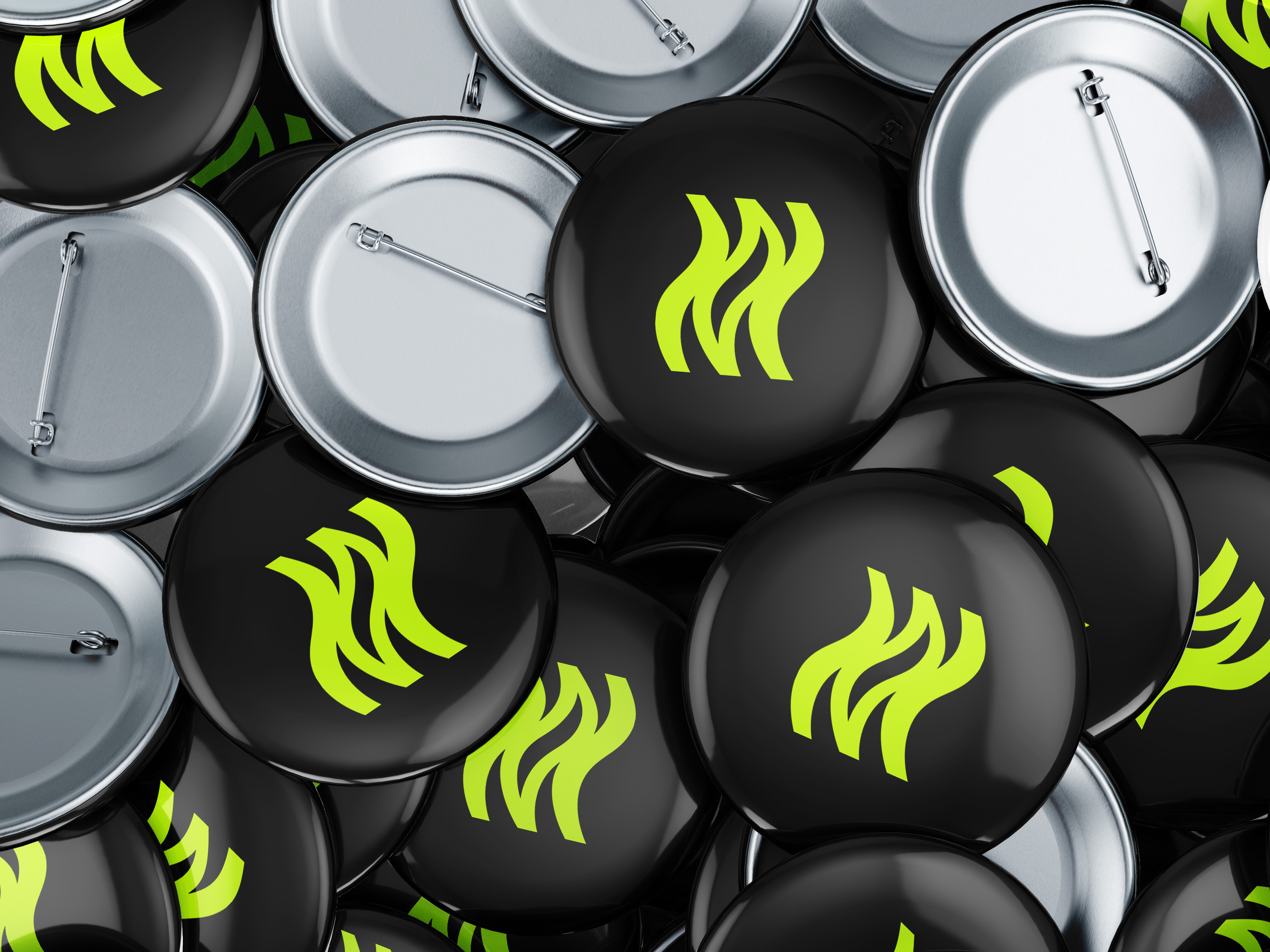
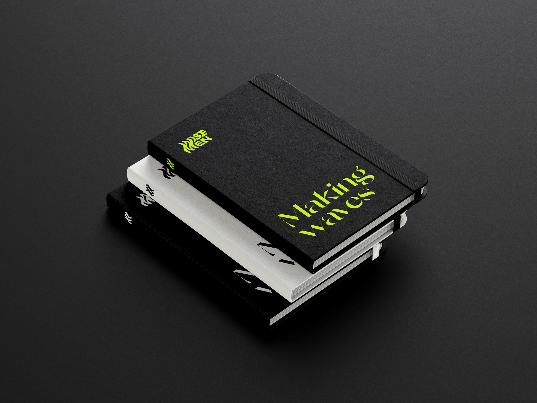
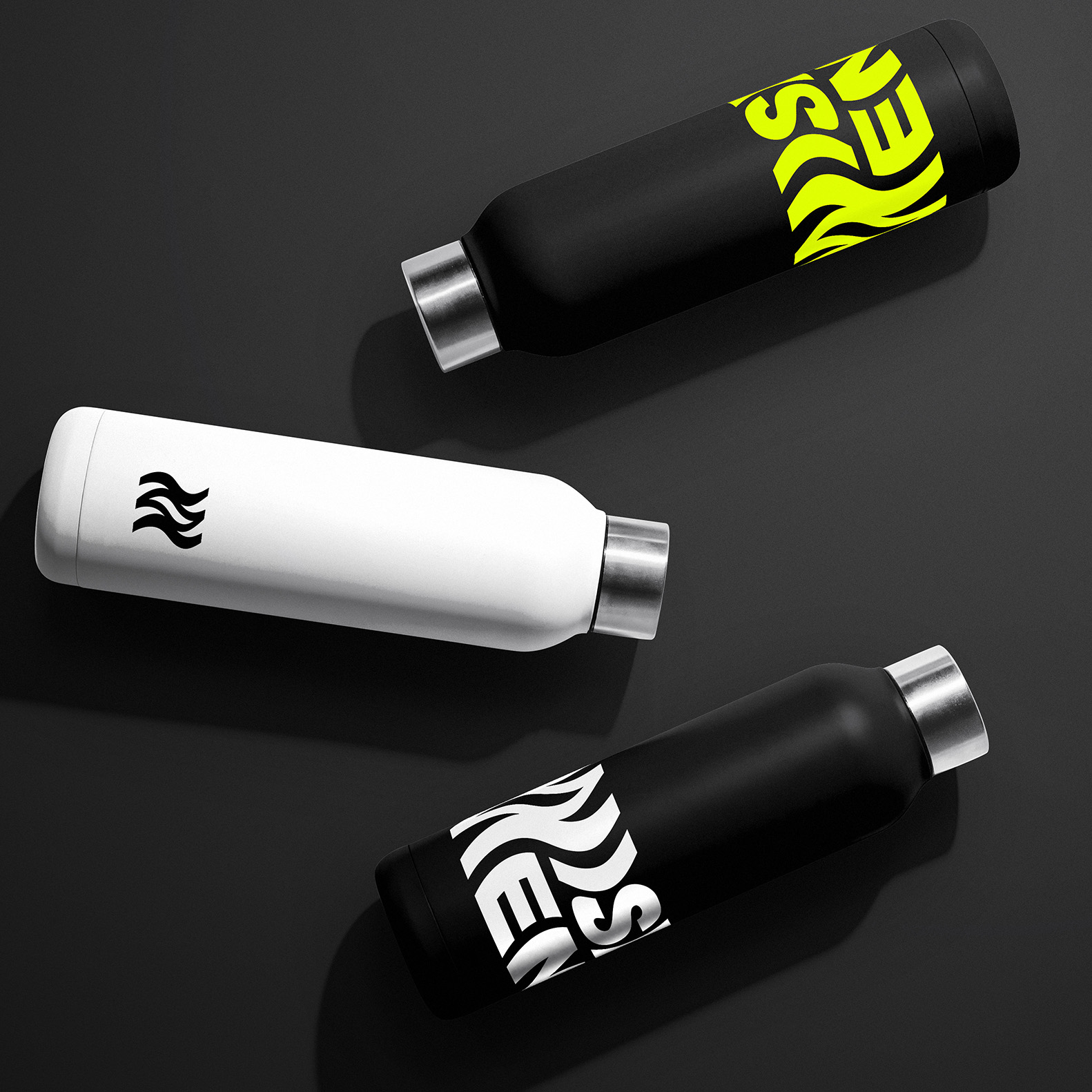
Merchandise
The distinctive wave motif, a visual representation of evolution and change, is artfully integrated into the merchandise designs, symbolizing the commitment to adapt and transform continually. The signature logo prominently displayed on select items signifies the diverse range of top-notch services Wisemen offers to its valued clients.
The extraordinary merchandise line from Wisemen emboldens its employees to defy the ordinary, inspiring them to embark on a journey of perpetual evolution, innovation, and boundless passion. It's a realm where rebellion converges with sophistication, allowing creativity to flourish, and where the merchandise itself stands as a testament to the company's distinctive, bold spirit.
Animation
Wisemen was in need of a few animnations. A logo under the tagline "Making waves" just asks for movement, which I included into the branding. Multiple versions were created suitable for multiple occassions. For the website I also edited the header video that embelishes the new design.